Baud is responsible for the creation of an entire visual system and the branding of a department with more than 800 references.
El Corte Inglés approached us with an ambitious project for the creation of all own brands and the implementation of its stationery department under the umbrella of its "Frost" brand.
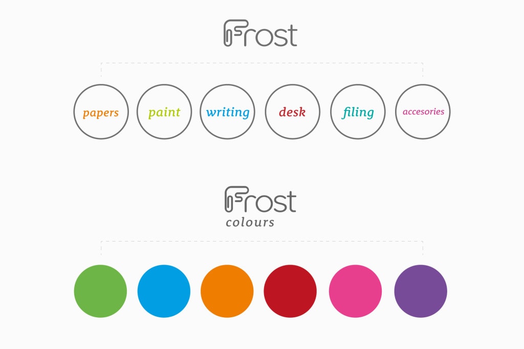
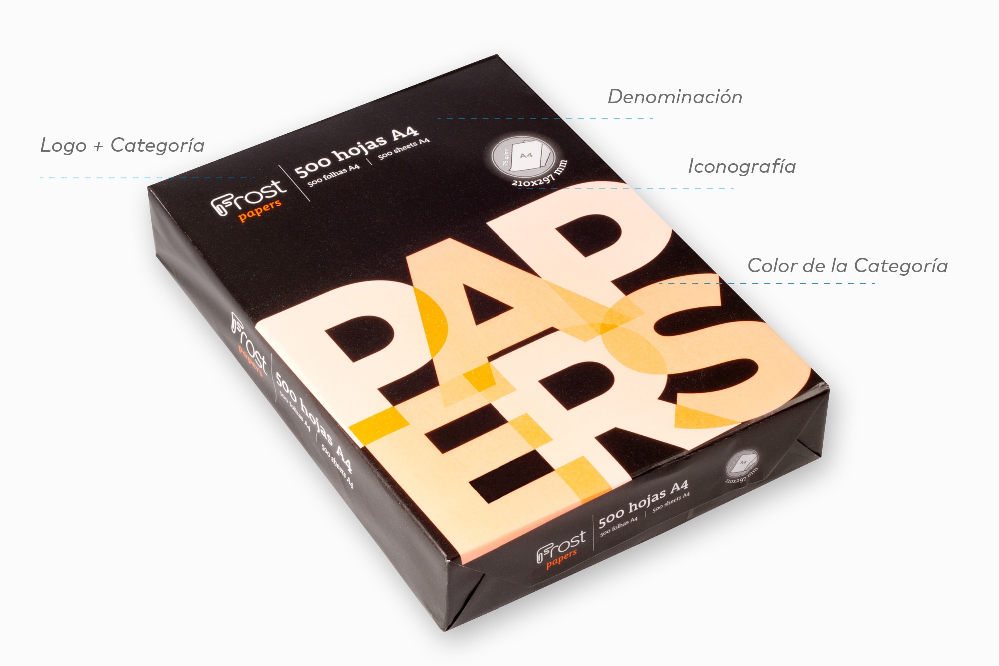
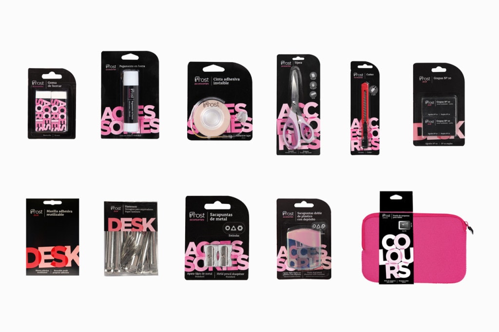
Finding the right positioning, the right target, defining the strategy to be followed and, above all, a complex brand architecture and implementation of packaging and visual system at point of sale.
The scenario was complex due to the large number of competitors on the shelf and the difficulty of finding a truly differentiating positioning against the competition.
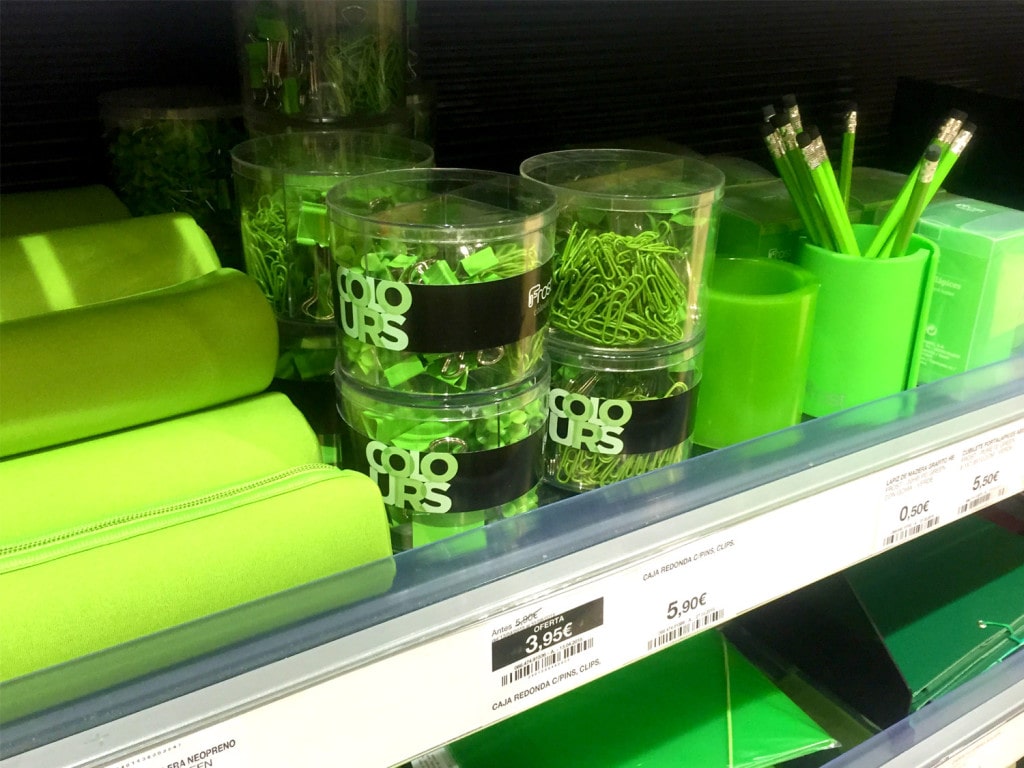
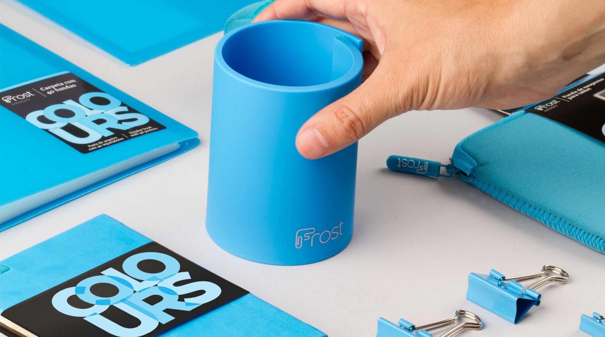
With our colors we were able to create a great visual impact on the shelf and break the barriers set by the positioning of the competition and take possession of a unique and differentiating place.
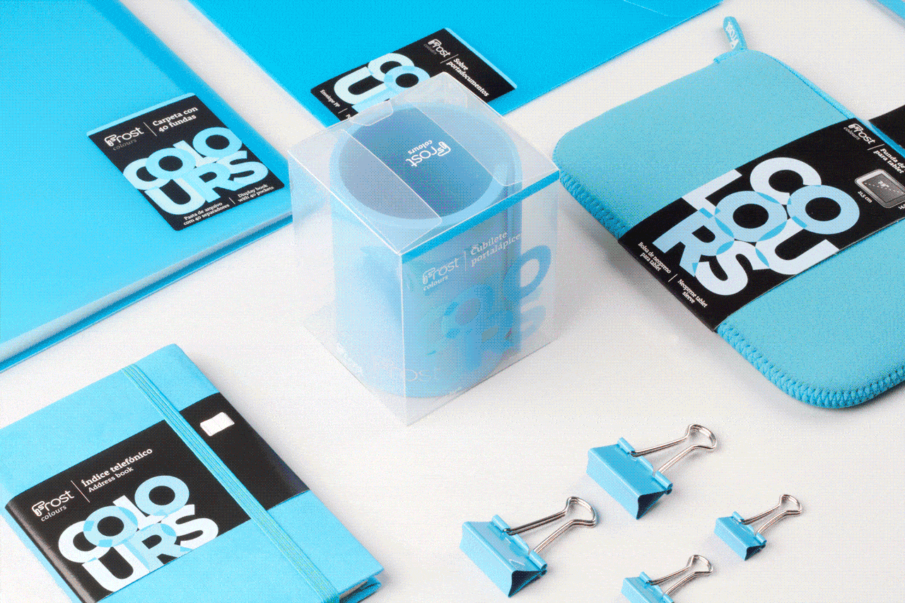
Frost uses bold colors to build customer loyalty.
The shelf was defined by colors and not by categories in order to facilitate impulse purchases based on aesthetic criteria.
We worked on a color-coded implementation of the product on each of the shelves, completely changing the concept of shopping in the stationery store of El Corte Inglés.