We developed the new collection of the Bodega El Corte Inglés, a complex project of Architecture of the product range solved through Design and Illustration.
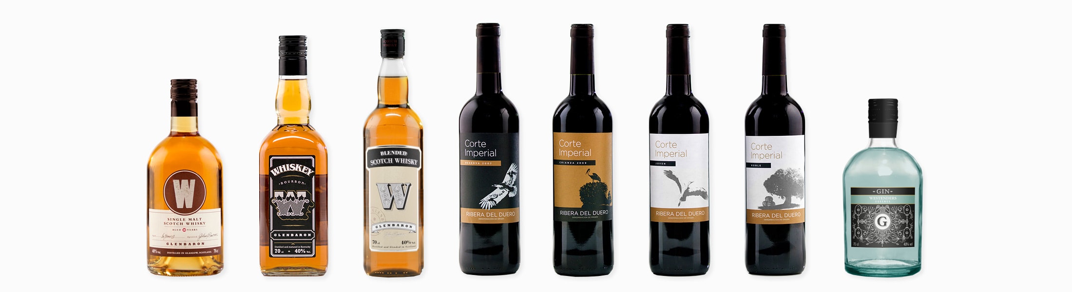
Product by product, we define a wide range from wines and champagnes to whiskies and gins.
The most complex part of the project was to unify and reposition all the products in the El Corte Inglés warehouse, in order to achieve better results on the shelves and build loyalty with younger customers.
10 YEARS SINGLE MALT
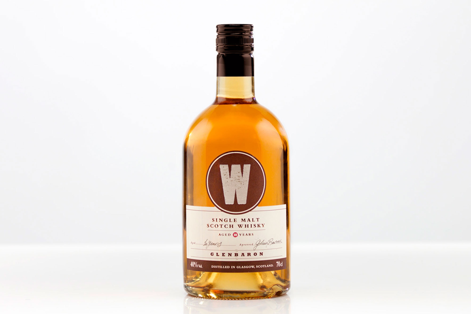
During the development of "Glenbaron single malt 10" we worked with traditional elements of the whisky world to reinforce its image of quality and Scottish craftsmanship.
BOURBON WHISKEY
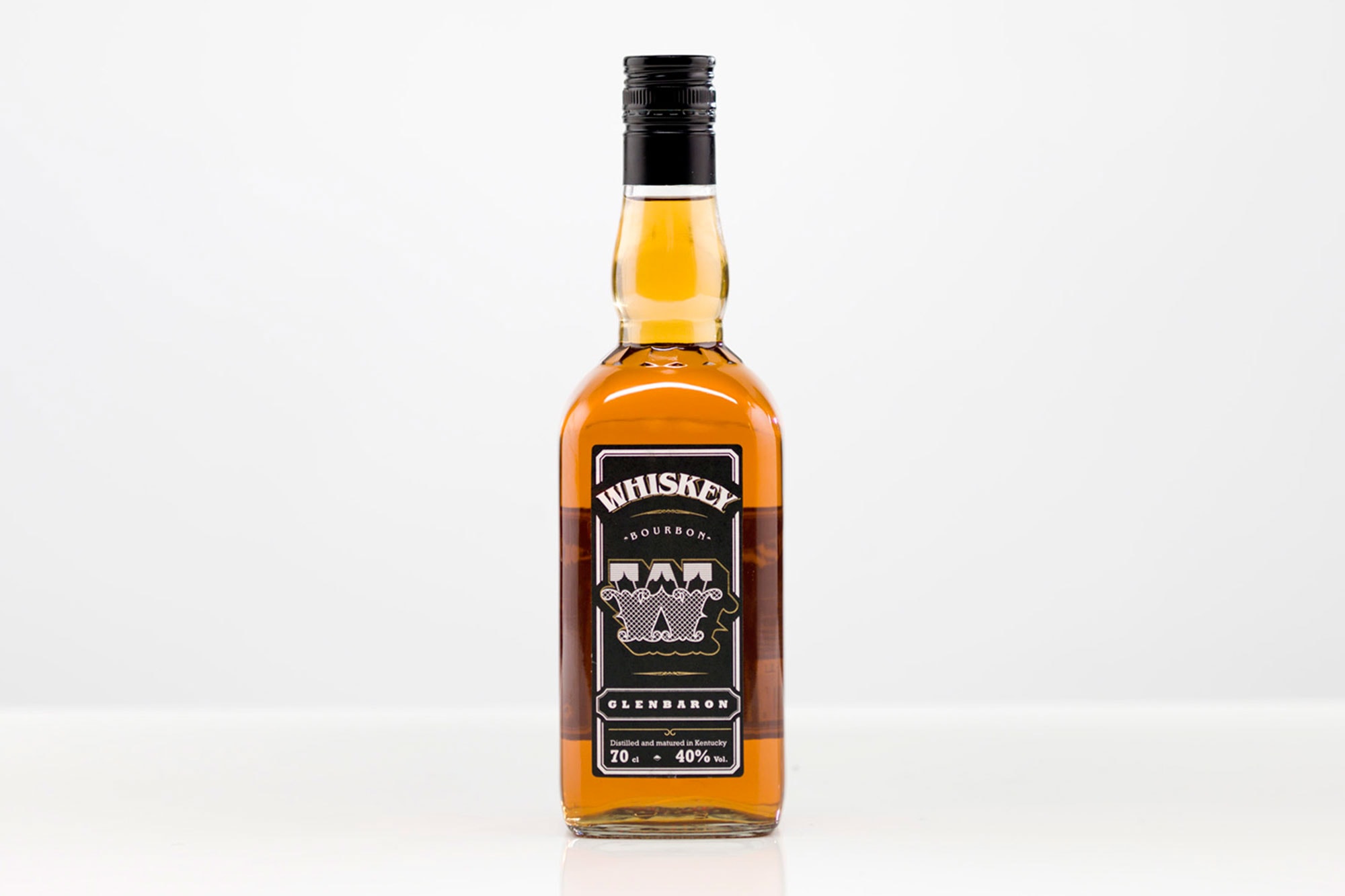
We work in a line within the needs of its category, looking for differential and quality finishes to improve impulse sales.

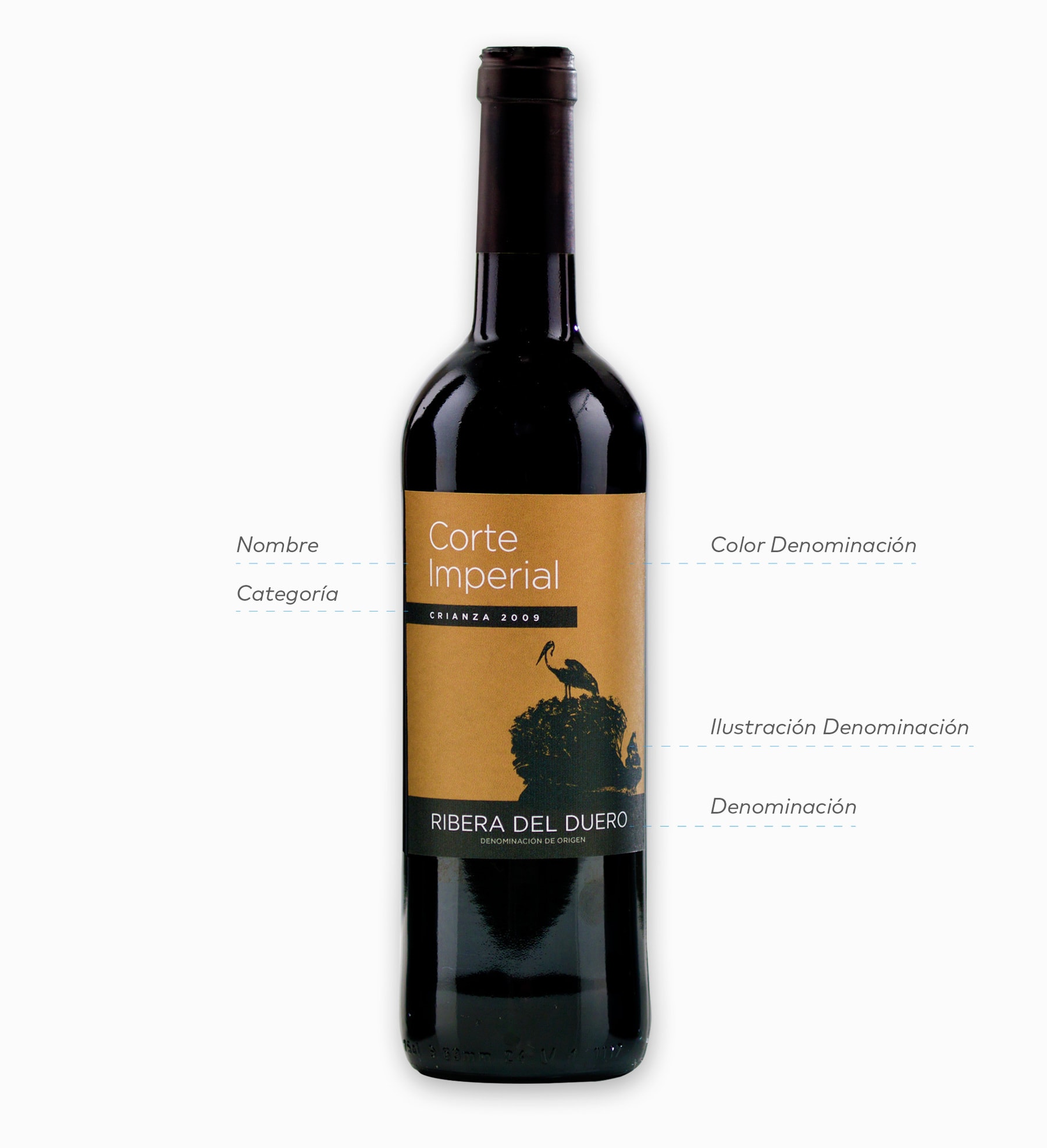
WINES
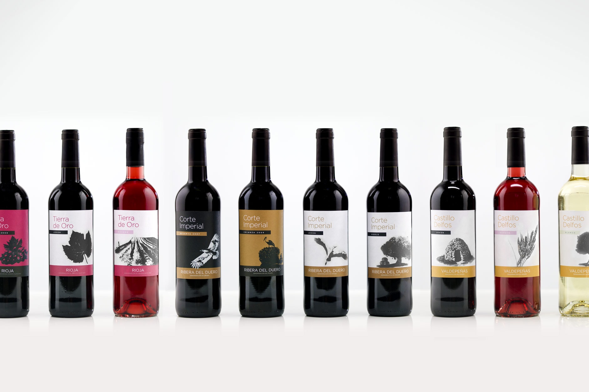
The design team developed together with our illustrator Federico Yankelevich a system of illustrations that represent elements of each of the Spanish appellations of origin.
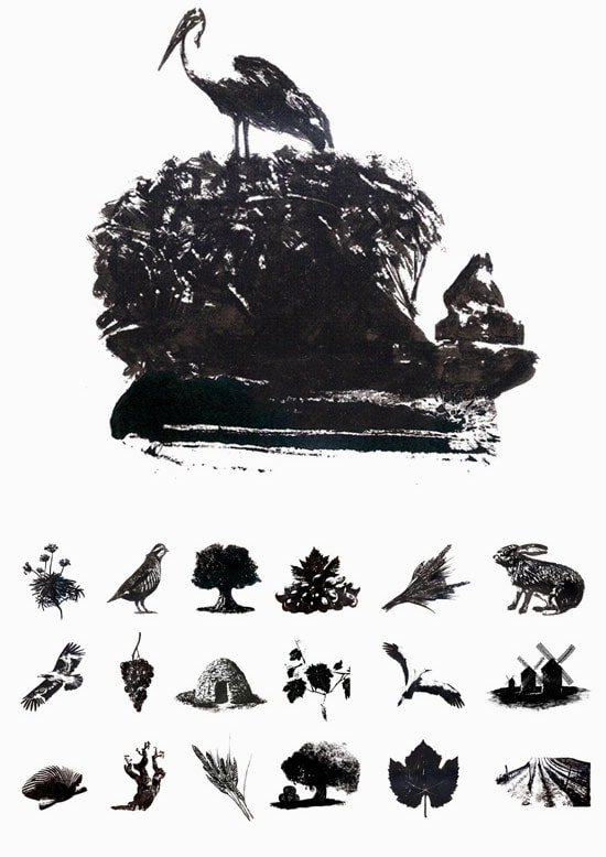
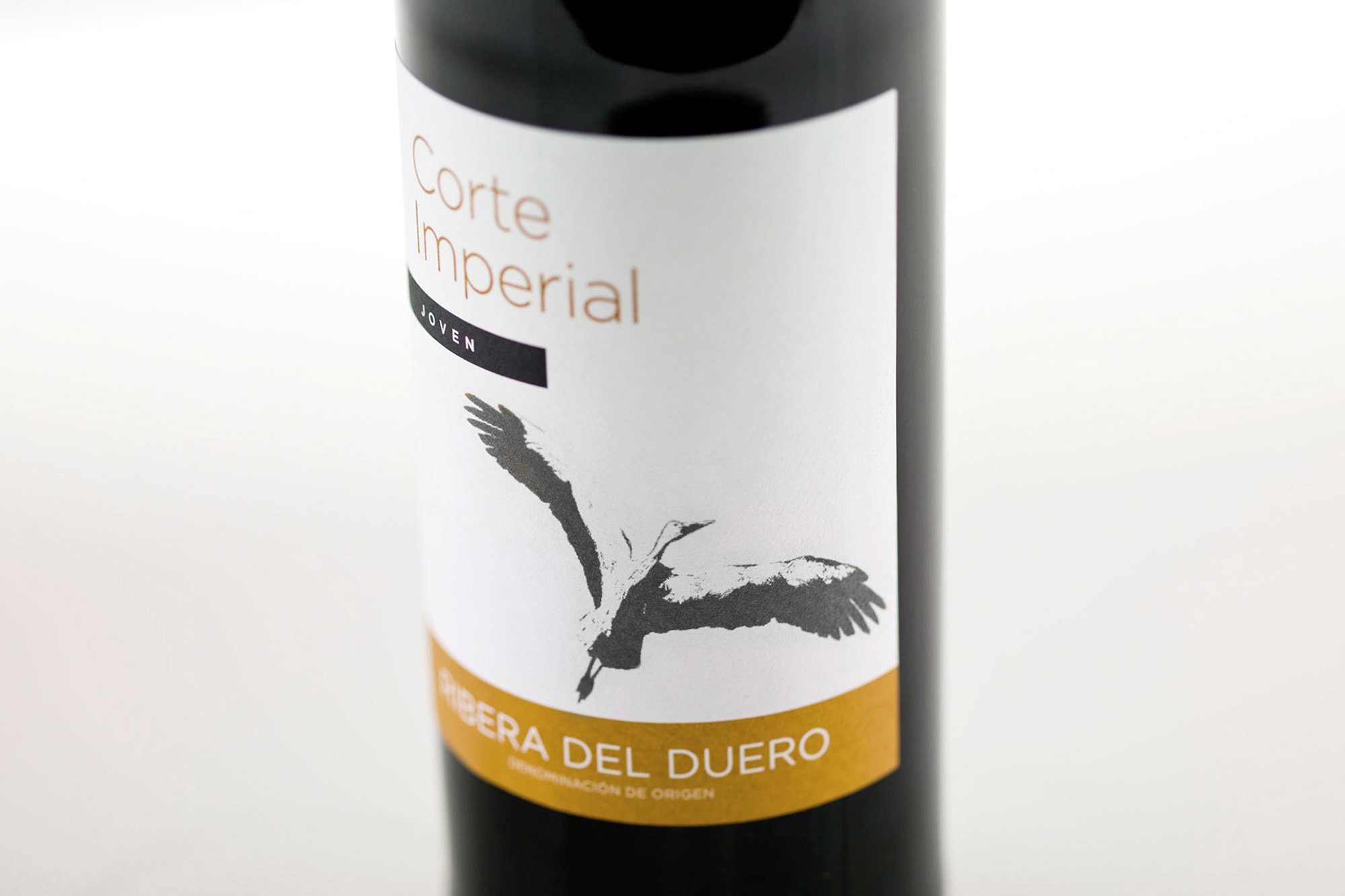
We use a system of colors applied in different ways to the label in order to hierarchize the appellations of origin.
With colors, positive, negative and the use of illustration, we managed to visually classify more than 30 warehouse references, to facilitate an intuitive purchase for consumers.