Optics 2000
THE FOCUS
As the central axis of the Optica2000 products, a visual concept was developed inspired by the act of focusing and the circular shape of the pupil of the eye. A concept that serves as a starting point to create the packaging and the rest of the graphic pieces.

A groundbreaking design
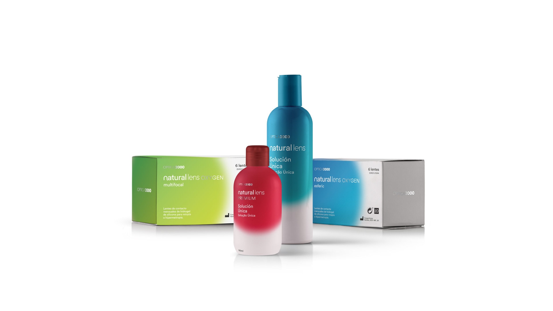
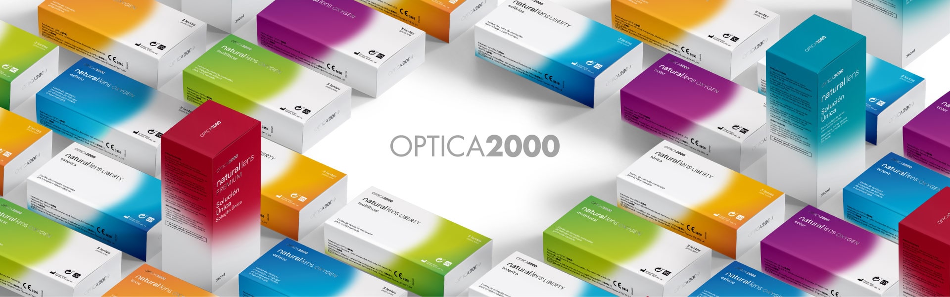
The new packaging for Optica 2000 and its Natural Lens range had to enhance the private label product to make it more competitive and attractive for its customers. We proposed a new identity based on the visual concept and using a color system that categorizes the products making the purchase easier and faster.

The clean, lively and optimistic color palette conveys the benefit of the product in a dynamic and fresh way.
In addition, the new packaging differentiates the product categories by inverting the colors of the design in the case of the basic range.
Same brand, new vision
Both the repositioning of the Optica 2000 brand and the redesign of its packaging give both a unique personality, making them more competitive compared to other players, while maintaining the quality and values of belonging to the El Corte Inglés family.