Tiendanimal

Tiendanimal.com had a privileged position as the leading Spanish website for pet products.
However, it had a poorly defined strategy and an image anchored in the online environment that prevented it from expanding into new channels. At a time when the company was facing its big leap into the offline world, it counted on Baud to redirect its trajectory.

The first step was to define a brand strategy that would establish Tiendanimal's values, positioning and value proposition, key pillars for having a coherent brand and meeting the company's objectives.
New challenges, new identity
The definition of this strategy was reflected in the redesign of Tiendanimal's identity. A new image that evolved the brand towards its new expansion strategy.
Information on Tiendanimal
The evolution of the Logo
For the wordmark, which is a natural evolution of the previous one, we opted for a typography with rounded and friendly vertexes, which transmits professionalism and at the same time is approachable.
Adapt your symbol
Starting from its old isotype, a simplified version was created, much more identifiable with its sector. This evolution eliminates the mouse so as not to focus the brand on the online media and changes the claws for a much friendlier footprint.
We understand pets
A claim that conveys the brand values and defines the company's philosophy. A phrase that is inspired by the empathy that the brand shows with its customers and their pets. Because in Tiendanimal they understand animals and know what is best for them and, therefore, owners feel at ease.
The brand now has a recognizable verbal identity that is simple and approachable, with messages integrating the brand, the owner and the pets.
Visual Identity
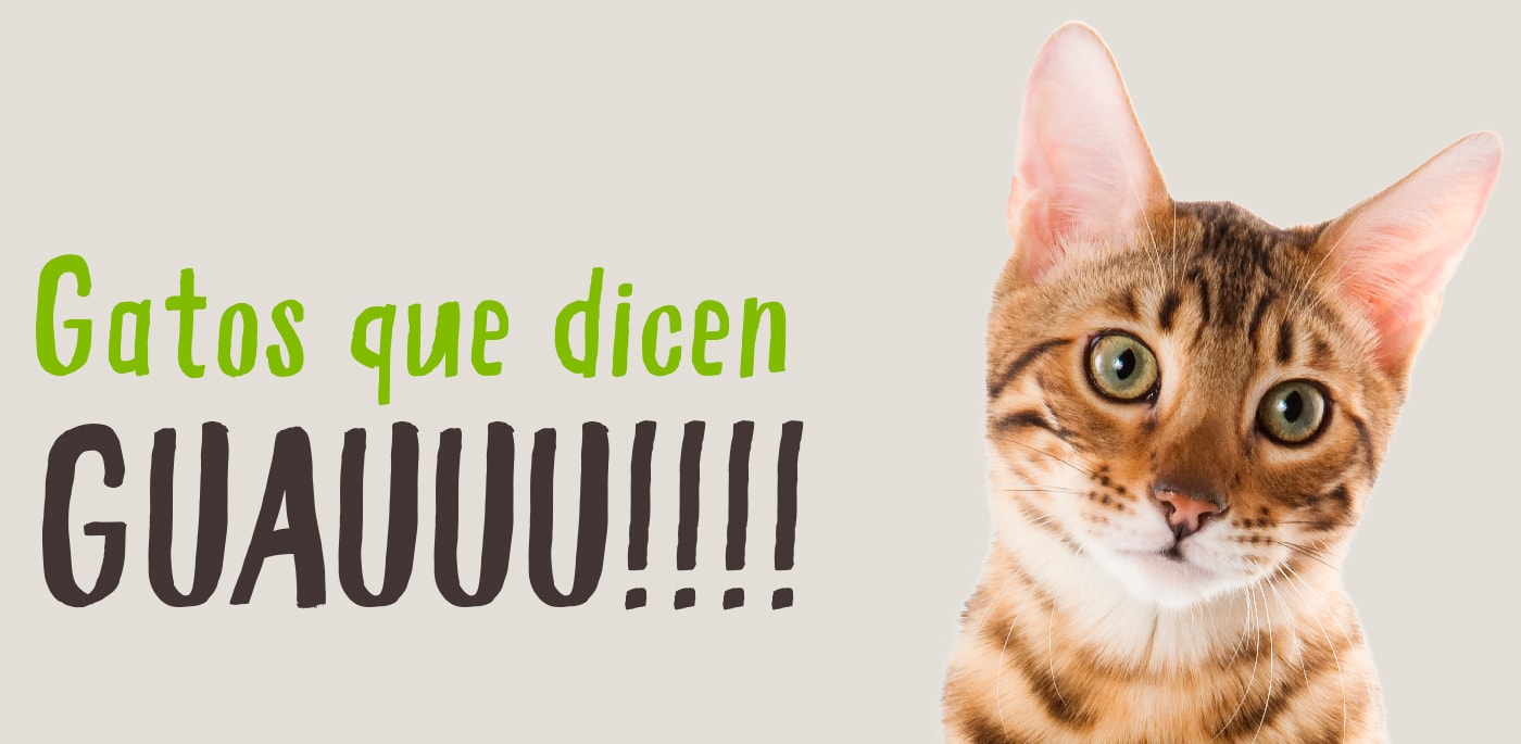
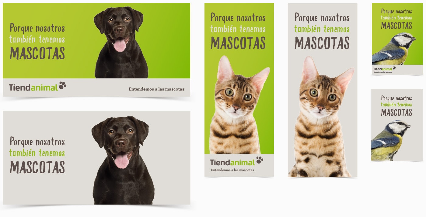
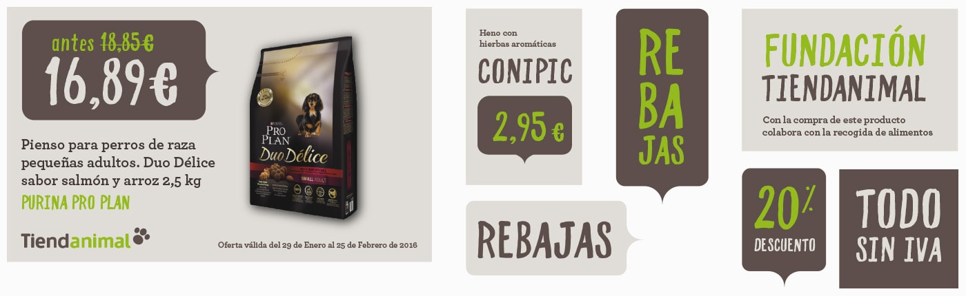
After a work of visual organization of all categories, we provided the brand with visual tools: layout, use of speech bubbles and other elements, specific typographies for communication pieces, gradients... An infinite visual system with which the brand can express itself in all formats, according to the needs of each moment.
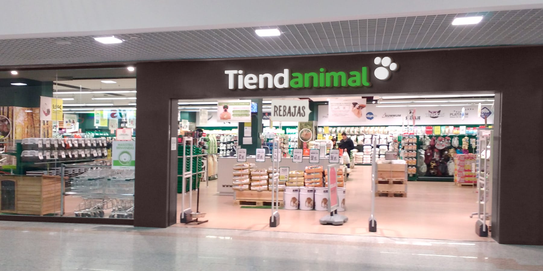
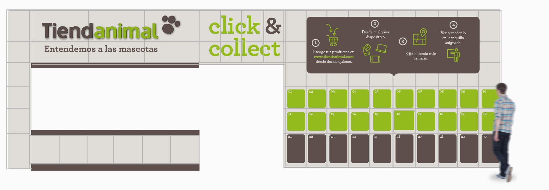
From leading online sales to leading the retail sector
The main challenge of the project was to transfer the spirit of the brand to the new stores. Spaces that should breathe Tiendanimal's love for pets, the knowledge of the sector and also the offer and professionalism of the company.
Information on Tiendanimal
An infinite visual system with which the company can express itself in all formats, creating multiple formats, according to the needs of each moment.
The brand's applications went far beyond signage.
By using iconography with the color-coded identification system, we differentiate the sections and make the customer experience more intuitive across all channels and media.
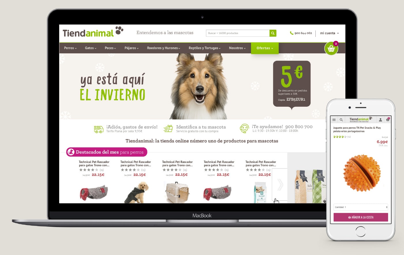
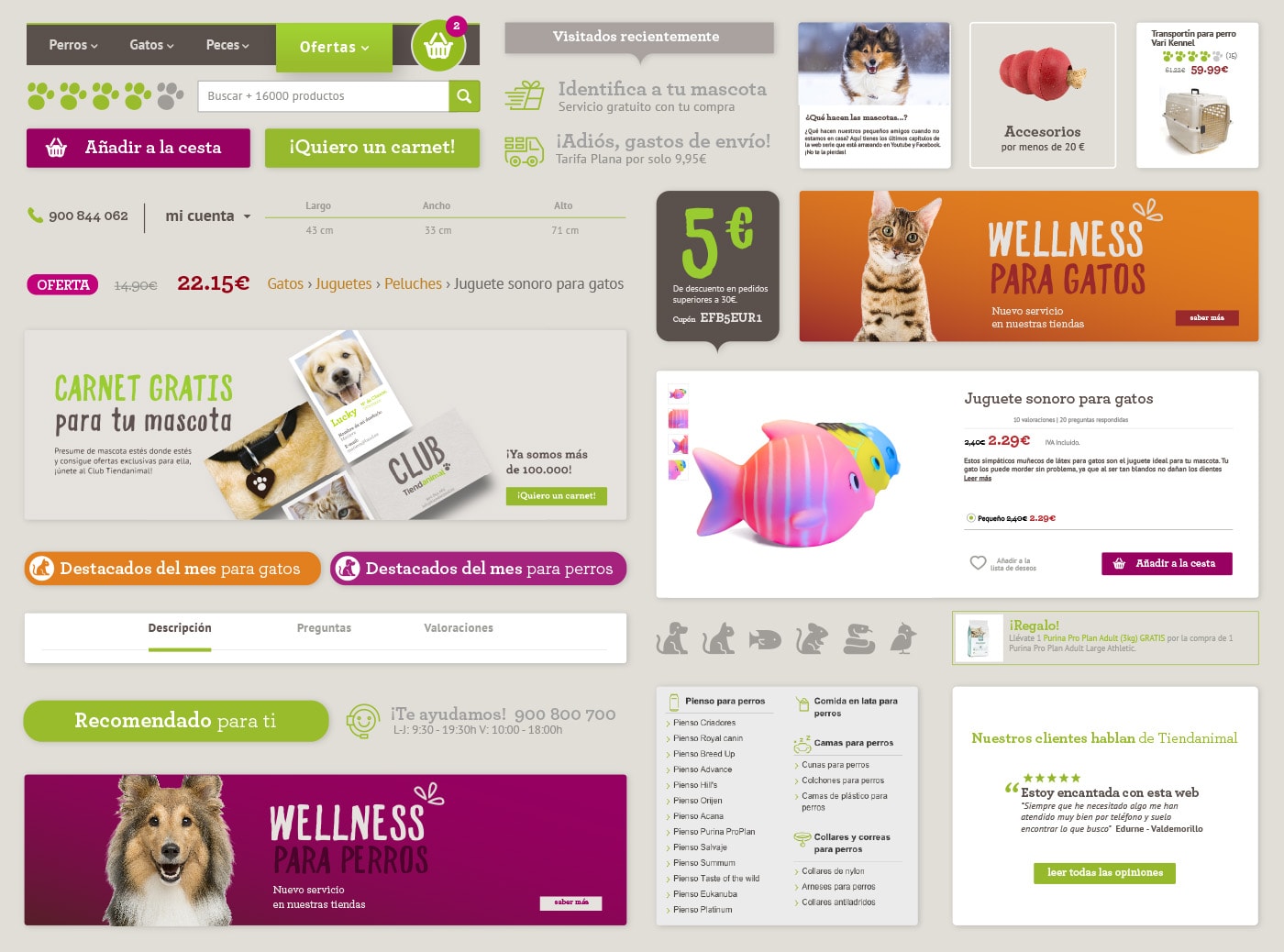
Ecommerce
One of the most delicate points of the project has been the update of the image in the online store, its main point of sale. In order to integrate the new identity and match the shopping experience on the web and in the store, a meticulous transition plan was developed hand in hand with the client to improve all the vital elements of the ecommerce.
Iconography
For the project we also developed an iconographic family of more than 100 references to facilitate the understanding of the wide range of products and services of the brand: adoption, care, textiles, click&collect, grooming, food... for all animal families.
The icons, as well as the logo, are close and with a touch of fun. With a simple and open stroke, they are friendly without losing their main informative function.


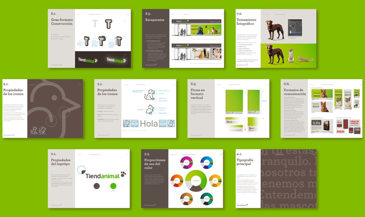
Defining guidelines for the future
Each one of the dozens of brand applications has been archived and scheduled to create a simple, scalable and applicable system for internal departments and different agents acting on the Tiendanimal brand.
Reinforcing its growth as an omnichannel leader
Tiendanimal has an ambitious growth plan where branding is a key point.