Dapac

Information on Dapac
APPROACH
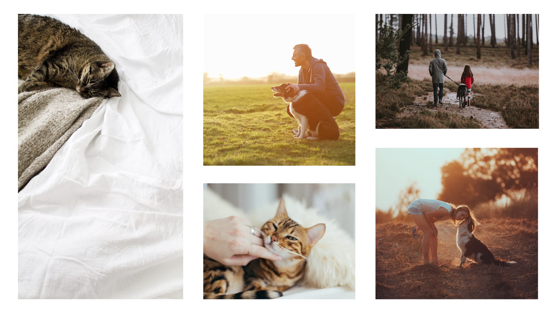
The petcare sector grows year by year in our country and with it the number of companies that decide to launch their own products and services related to the feeding and care of our pets, generating an increasingly crowded market, heterogeneous and often confusing for the final consumer.
In 2006, Dapac was born as a purchasing center, through the union of several cooperative professionals with a great experience in the petcare and petfood sector. And it does so with the aim of preserving the quality of pet products, being transparent in their actions and working from the respect for animals.
CHALLENGE
Dapac emerged as a company name only. The main need was to start defining Dapac as a brand in itself and to transfer its competitive advantage to both B2B and B2C audiences.
On the other hand, we were faced with a complex product portfolio, where the products already marketed by each cooperative were integrated into the new brand. Clarifying this portfolio was a fundamental point of the project we developed.
SOLUTION
We created the Dapac brand through a discourse that gave it credibility and positioned it in the minds of the end consumer and the specialized channel.
We generate a homogeneous, close, honest and quality brand image for the sub-brands and products under a single seal of guarantee, that of Dapac.
We created a brand culture that would generate pride of belonging for all employees and cooperative members, as well as notoriety and brand recognition for the end consumer.

The project began with an exhaustive analysis of Dapac's main competitors, where we researched the companies, their expression, their identity and their product ranges. This analysis helped us to understand how the petcare sector works and the areas that we needed to strengthen in Dapac to improve its recognition and bring the brand closer to its target audience.
Through this research, we detected market niches around which the brand could grow being differential. We generated our own brand culture in which Dapac represented a mascot that grows, develops and lives to the fullest.
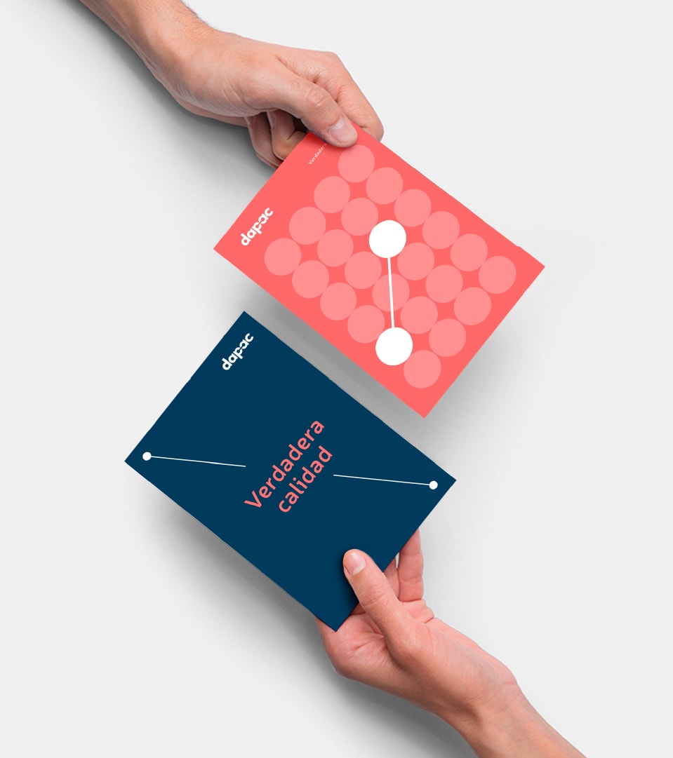
Dapac, a seal of quality
Dapac had a clear objective, which was reinforced and made visible from the brand strategy: the care of each ingredient, of each product, of each line, to always guarantee the highest quality. In a context where the word 'quality' had lost credibility, we managed to position the brand as a seal of quality within the petcare sector.
Dapac is the safe alternative for your pet, a brand that has earned the trust of the end customer and the specialized channel. Dapac is your ally in the petcare sector.
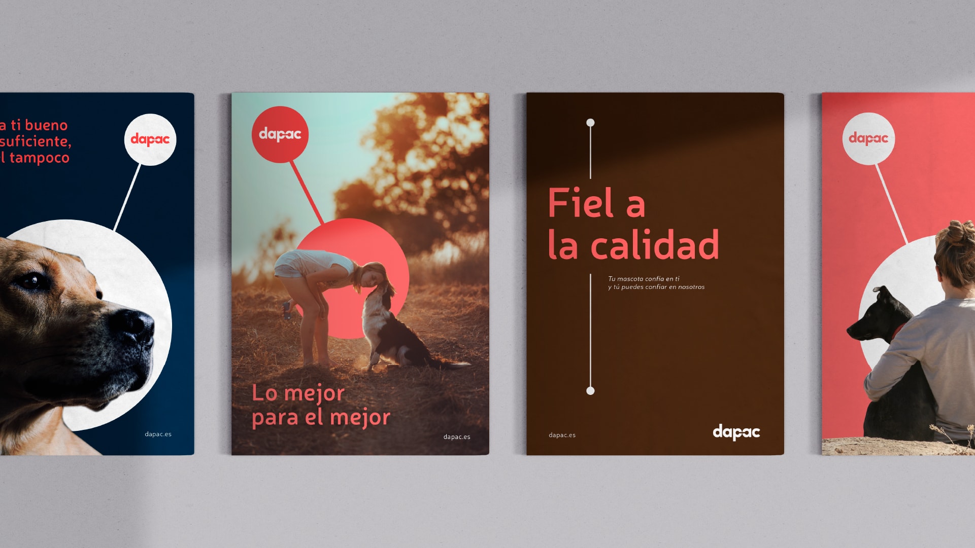
Transfer the differential to all contact points.
This quality, transparency, passion and respect for animals also had to be transferred to the verbal expression of the brand, so that each message could convey it.
We provided Dapac with linguistic guidelines that sought to convey their commitment to the sector and to animals, bringing them closer to their target. And a strong claim to convey the values and benefits of the brand and the product.
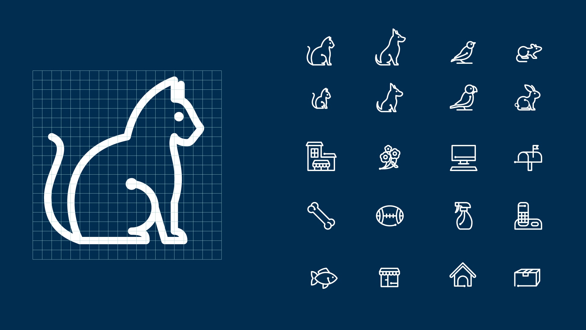
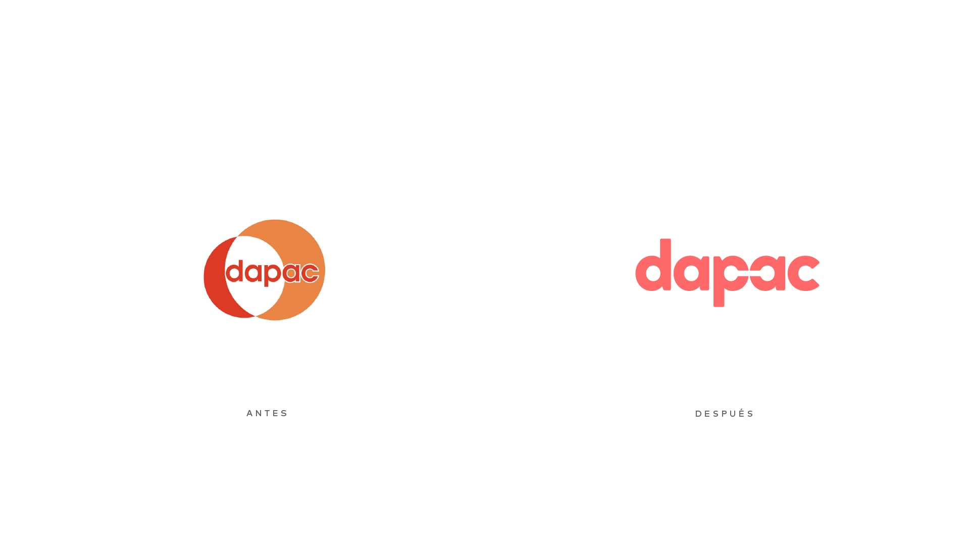
In parallel, we worked on a visual identity that, based on the brand's codes, would be redefined in a more memorable and attractive design on the shelf. From the typography to the chromatic palette, the secondary graphics, the photographic and illustrative style..., everything was designed to reflect Dapac's personality and the connection between the brand and the animals.
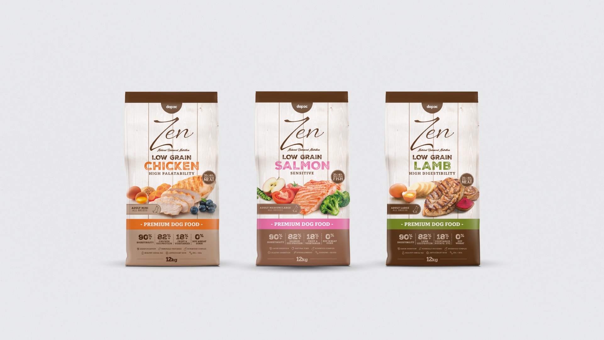
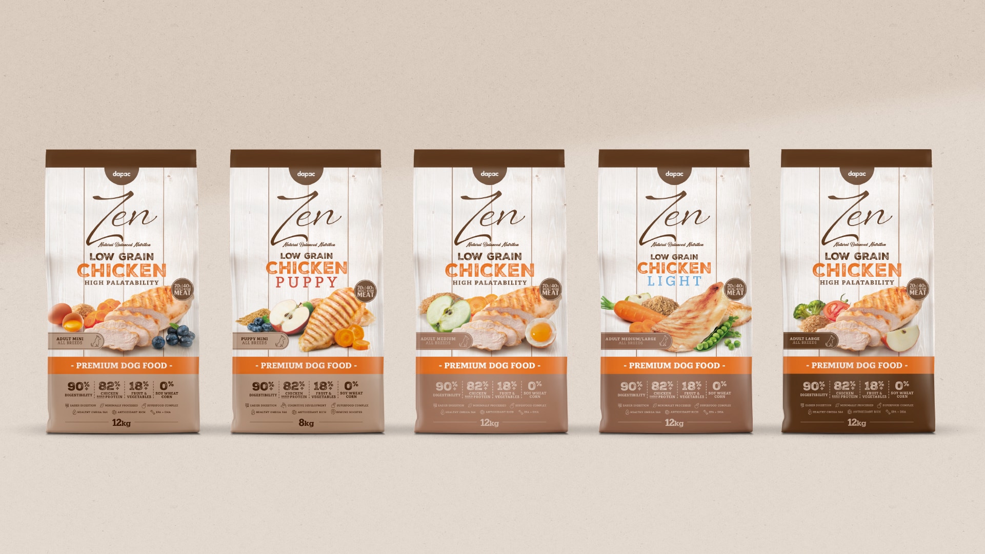
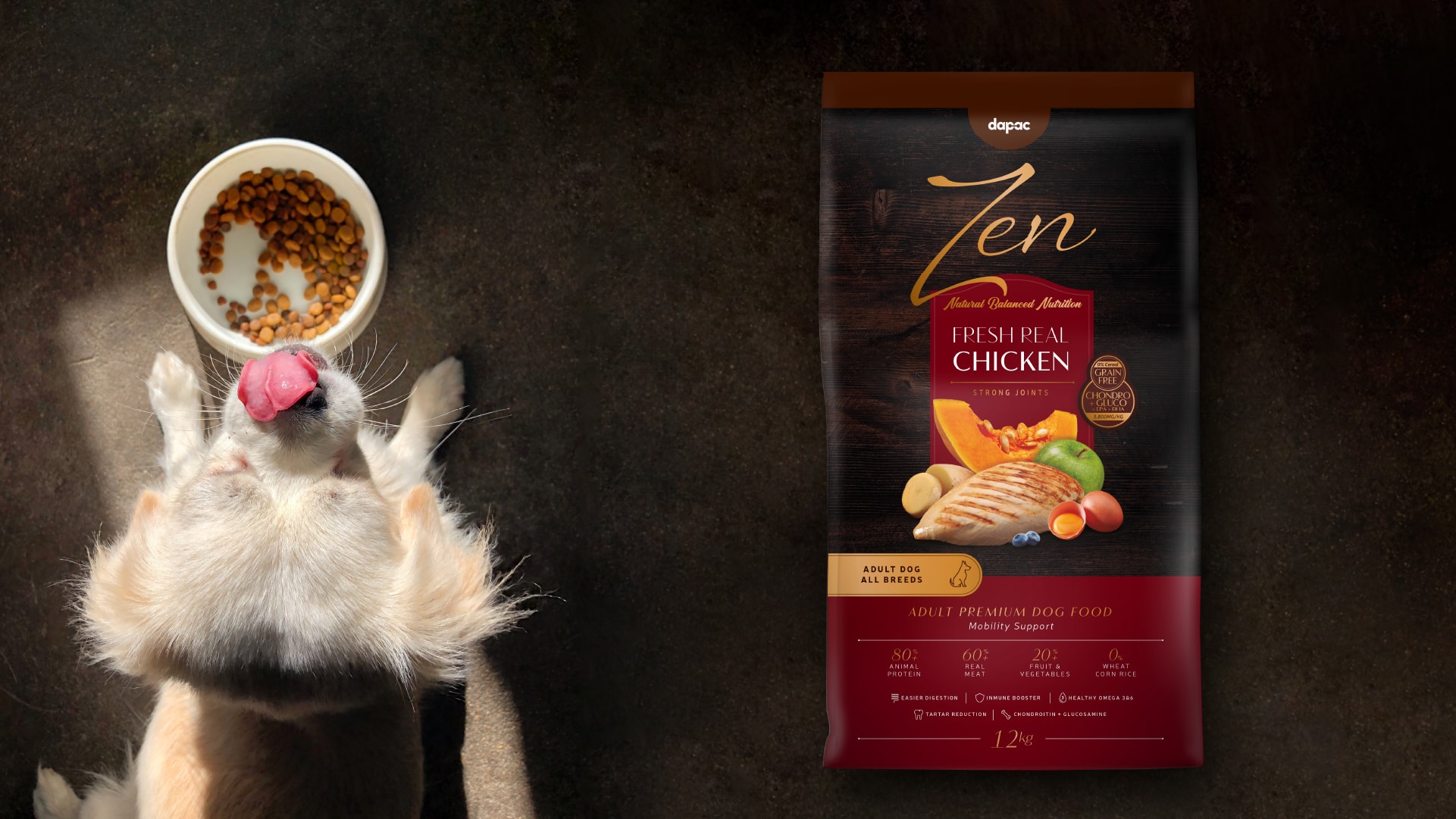
Packaging, the brand's main point of contact with the consumer
We designed a packaging with visual codes that reflected the differential value of the differential value brand and helped the buyer in the product selection process, as well as highlighting the product on the shelf.
Own brands were one of the main points of contact between Dapac and the end consumer, so it was essential that it reflected the brand values worked on.

A brand that reinforces the product
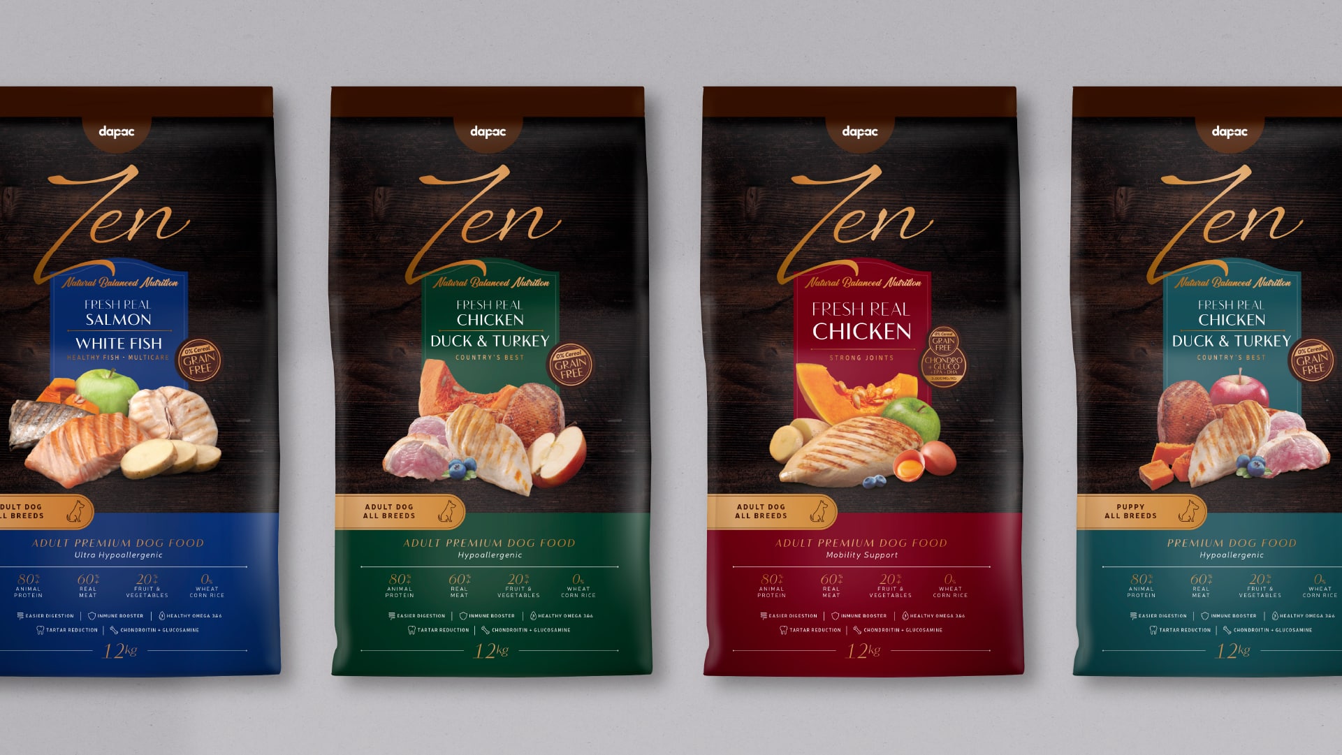
We generated a coherent endorsement system for each of the sub-brands, so that they were clearly identified with Dapac. For the first time, Dapac's products were unified under the same brand and visual codes, which allowed them to gain credibility, consistency and consumer recognition.
A packaging design that helped Dapac create a clear, homogeneous and approachable product portfolio.
Thus, we can see the work on the design of the premium sub-brand. ZenThe brand was designed to be based on the visual codes generated for Dapac and to reflect the exclusivity and quality of the product. A brand with its own character, which drank from the essence of Dapac to gain credibility with the consumer.
Packaging that reflects the honesty of the product
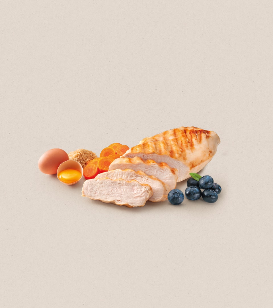
The quality of the product and its representation was present throughout the brand. It was also materialized in a packaging that highlighted the ingredients of each product.