Mr.Boho
Information on Mr.Boho
APPROACH
Mr. Boho, was born in 2012 as a result of the creative and entrepreneurial impetus of 4 friends: Daniel, Diego, Eduardo and José. What was initially thought as a small and limited project, today is already an example of growth and improvement for all fashion companies and start-ups in the Spanish market.
CHALLENGE
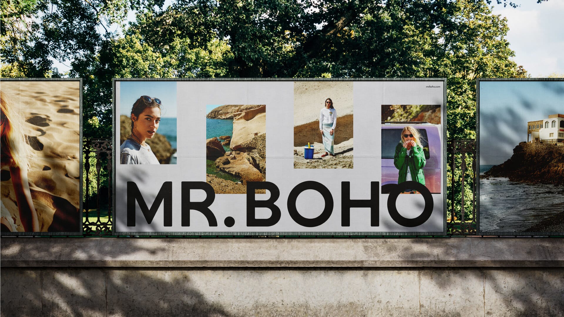
On the one hand, a new positioning based on the attitudes of the users who wear it; a brand experience based on efficiency, customer service and intermediaries; a powerful identity that speaks of what the brand is like; colors that are recognizable to the consumer; a meaningful art direction for the campaign photographs and a neutral and simple product photography that enhances the sales item and a typography with its own voice.
The main challenge we faced consisted of absorbing the previous identity, leaving it devoid of superfluous elements and at the same time trying to unify it again so that it would be evident that the MR. BOHO brand was ready for a new stage with higher aspirations.
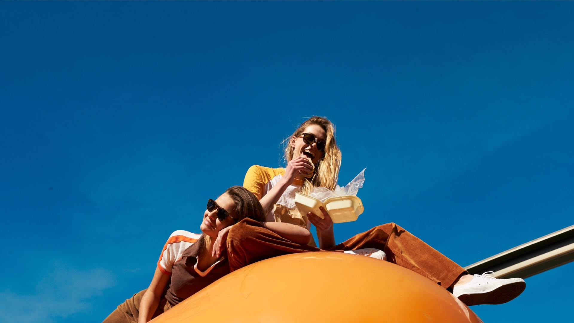
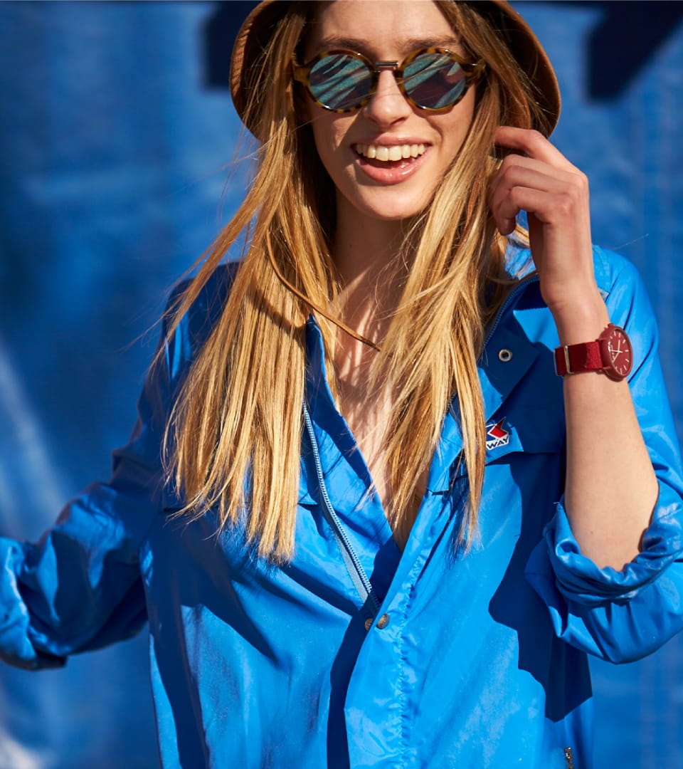
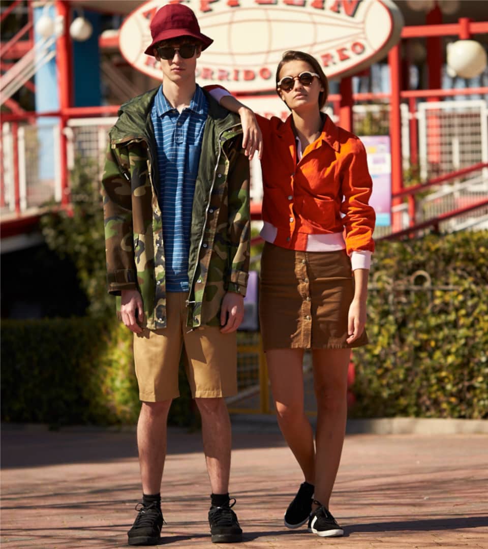
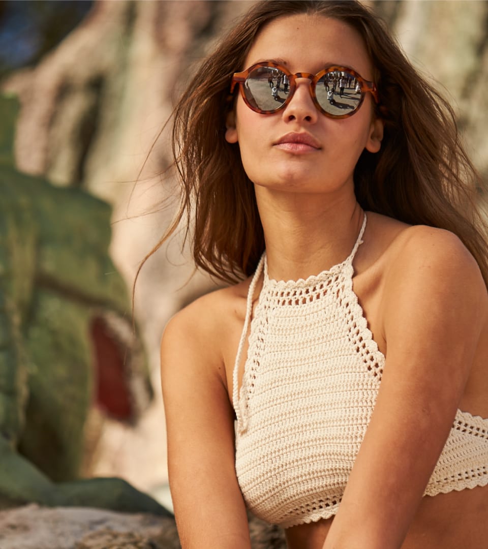
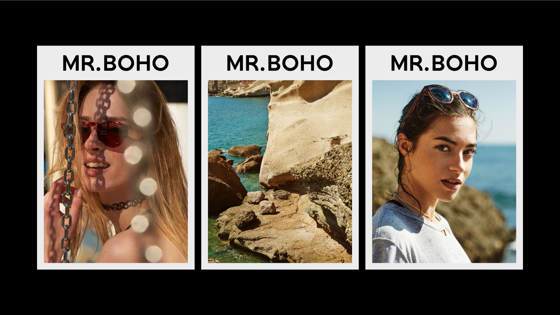
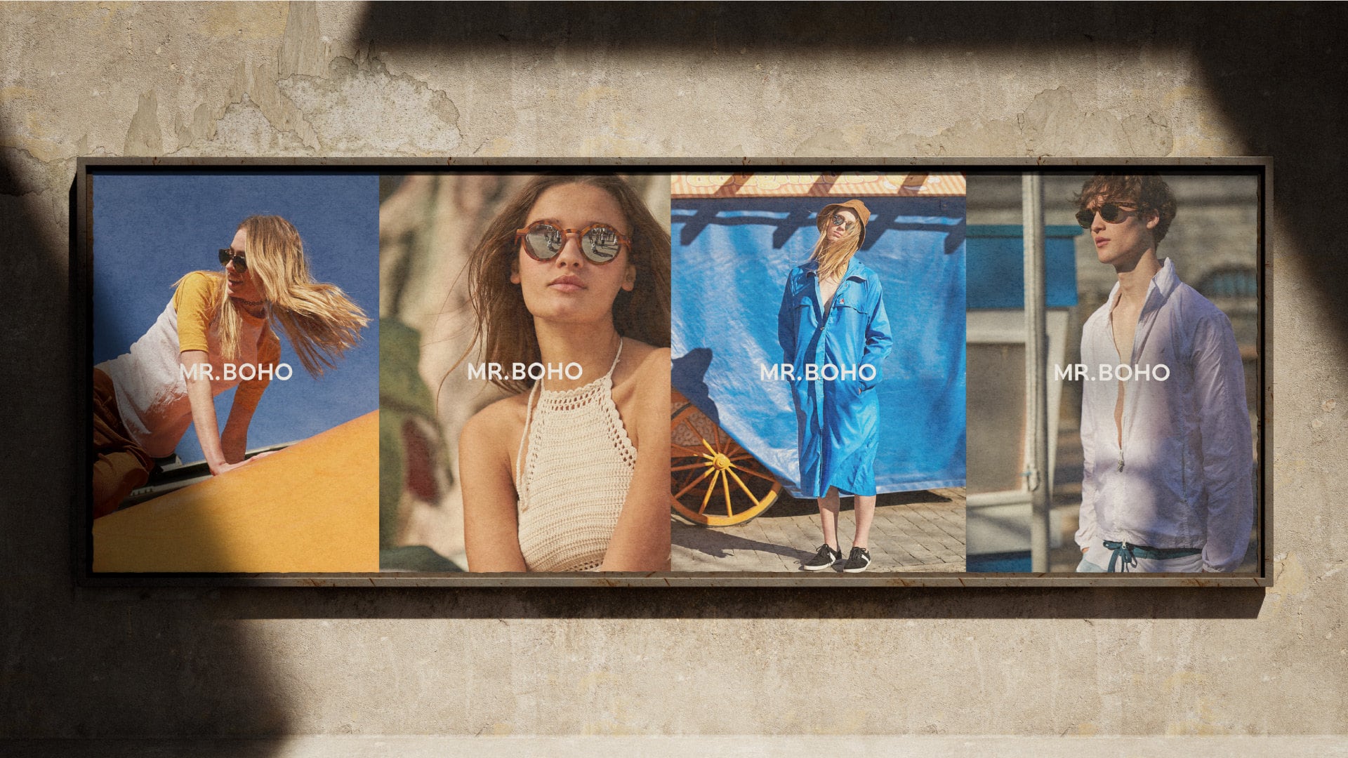
An attitude towards life.
"In the photographic section our proposal is based on portraying a certain generation giving importance to their attitude above their environment, profession, lifestyle... We seek to associate the brand with an attitude towards life beyond a style." Philippe Milton
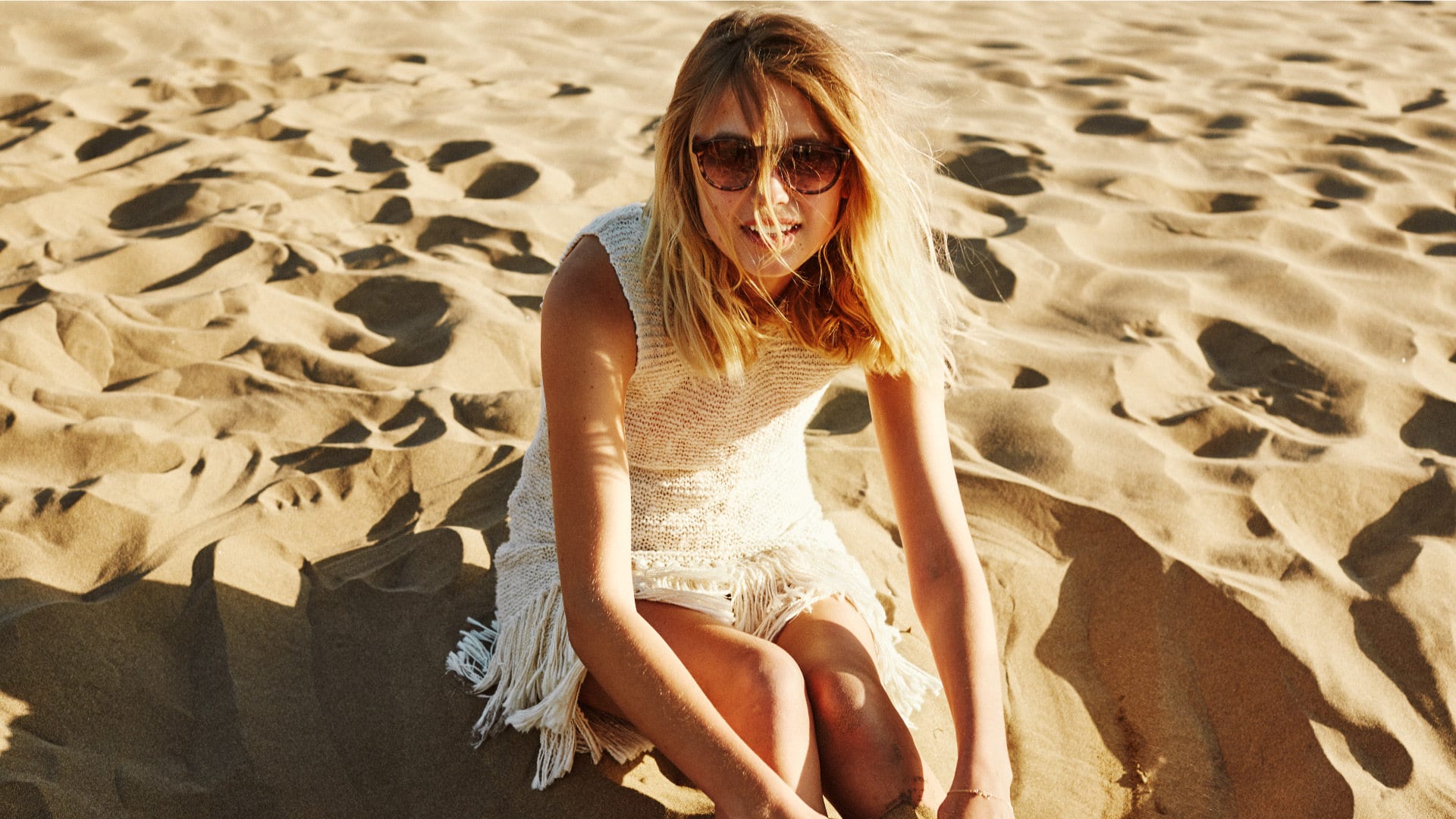
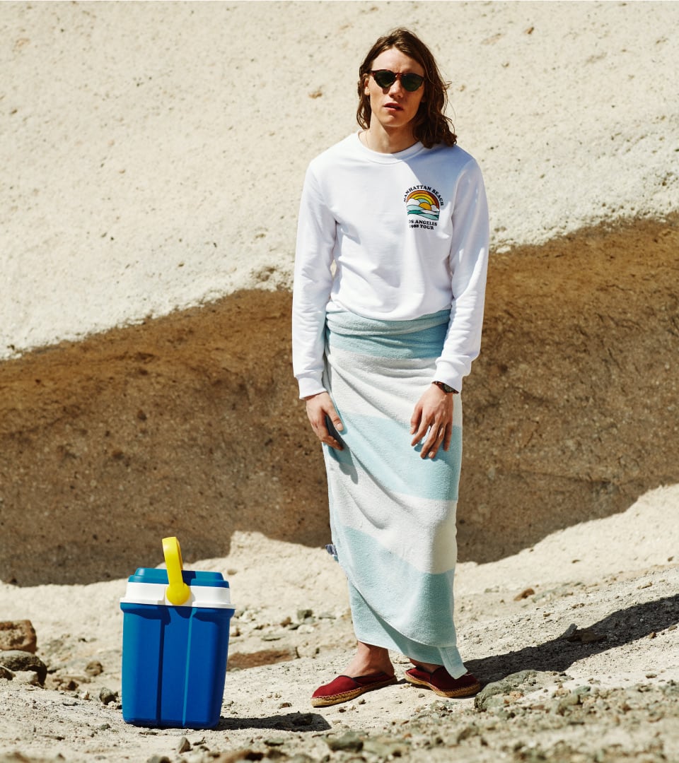
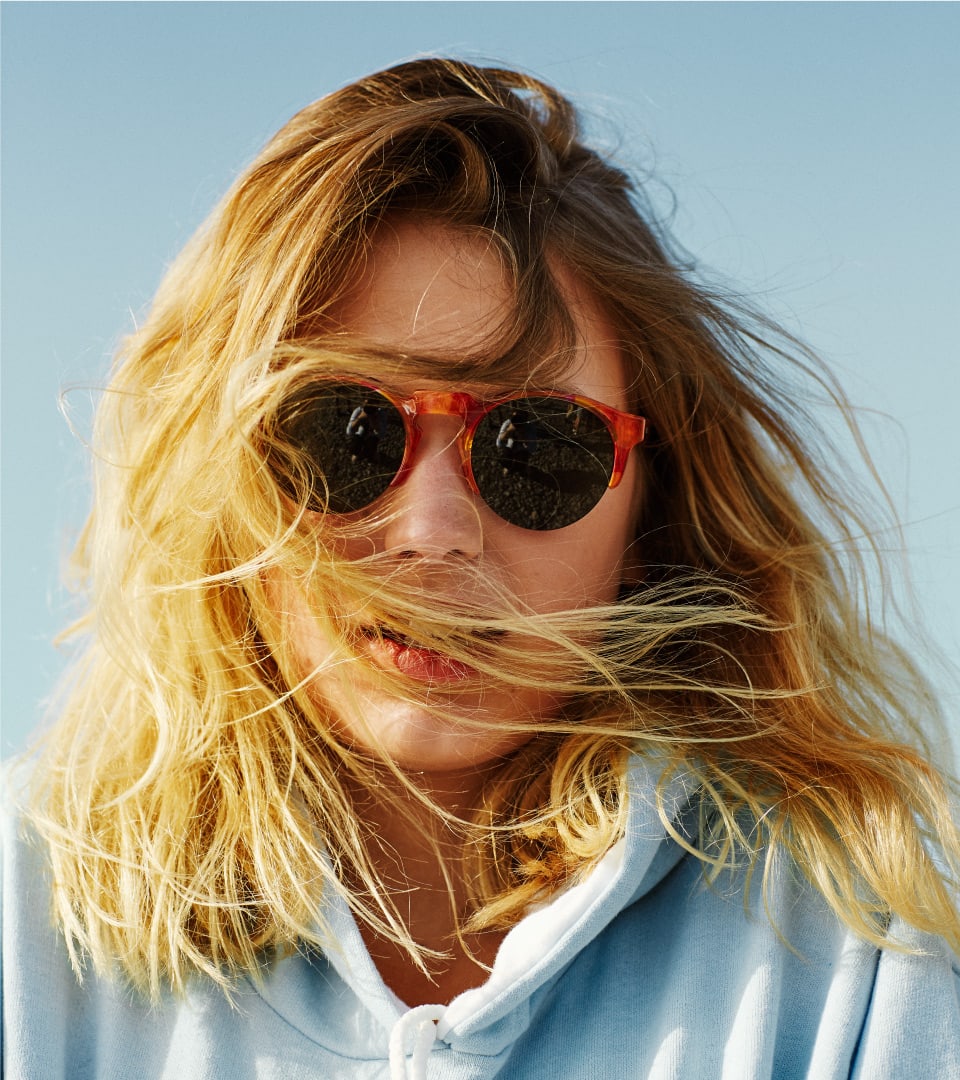
This same process was carried out through the use of colors that transmit refreshing, summery and jovial sensations. The result is a very powerful photographic campaign with high acceptance and a great engagement of the target audience.
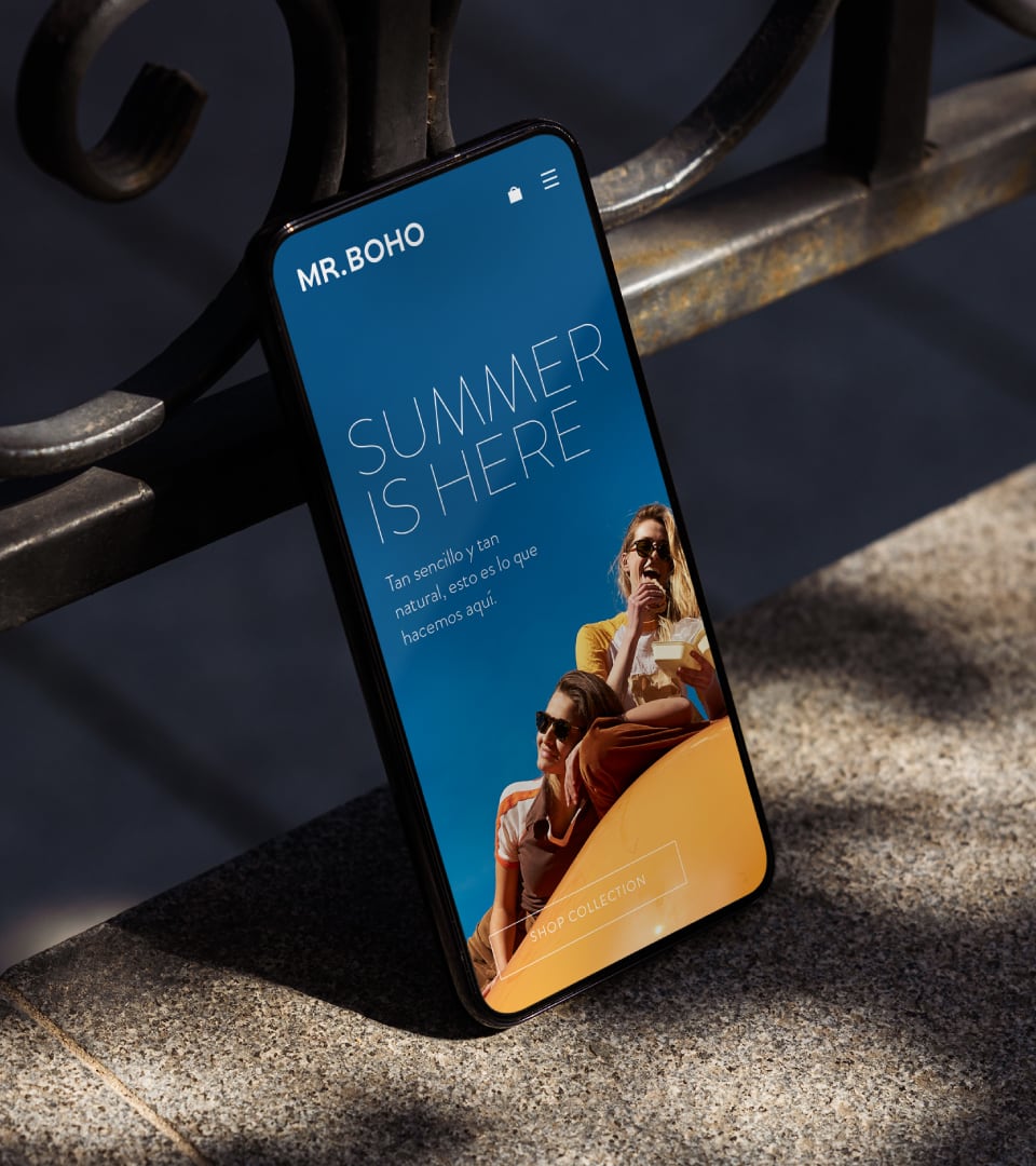
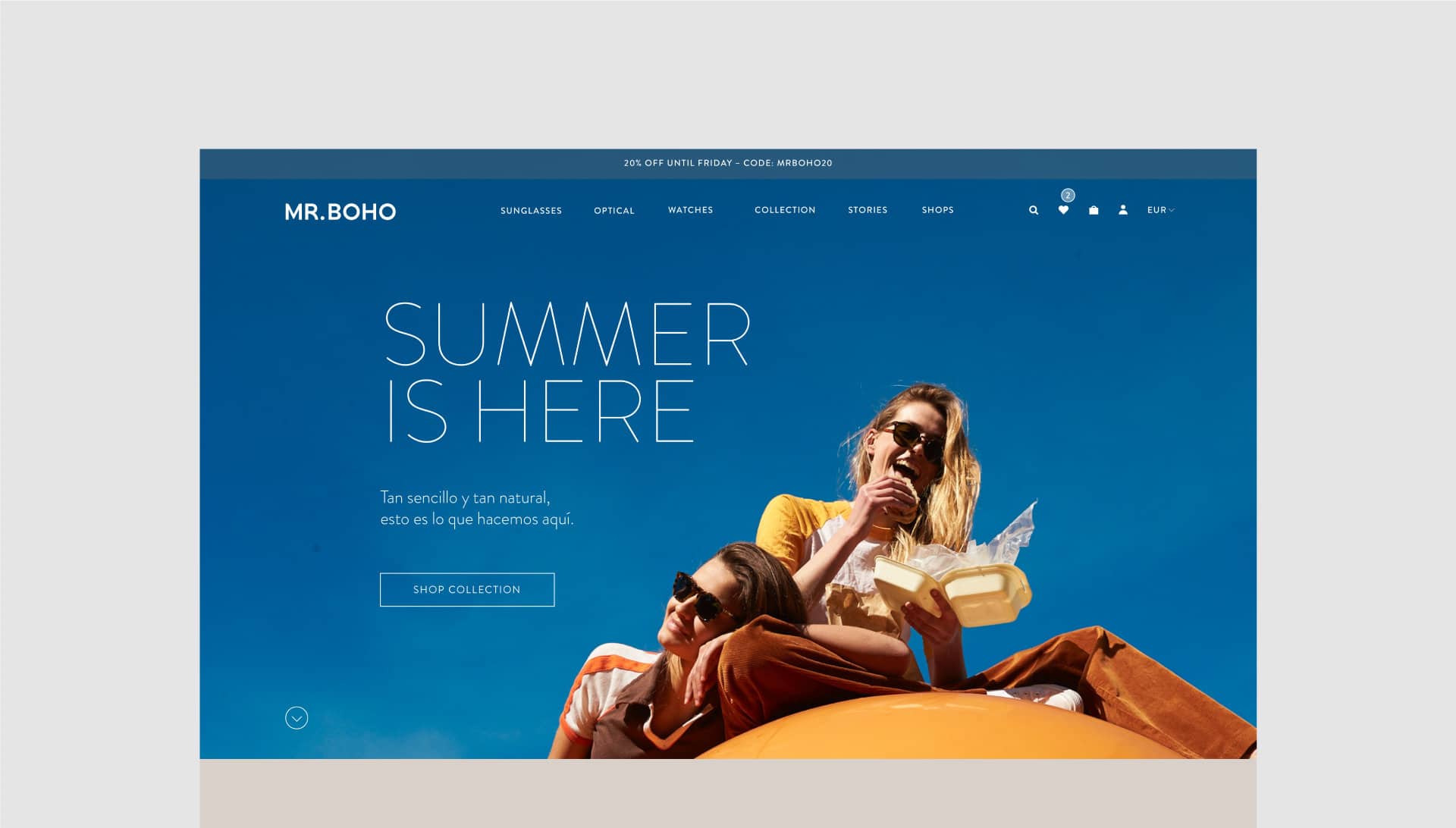
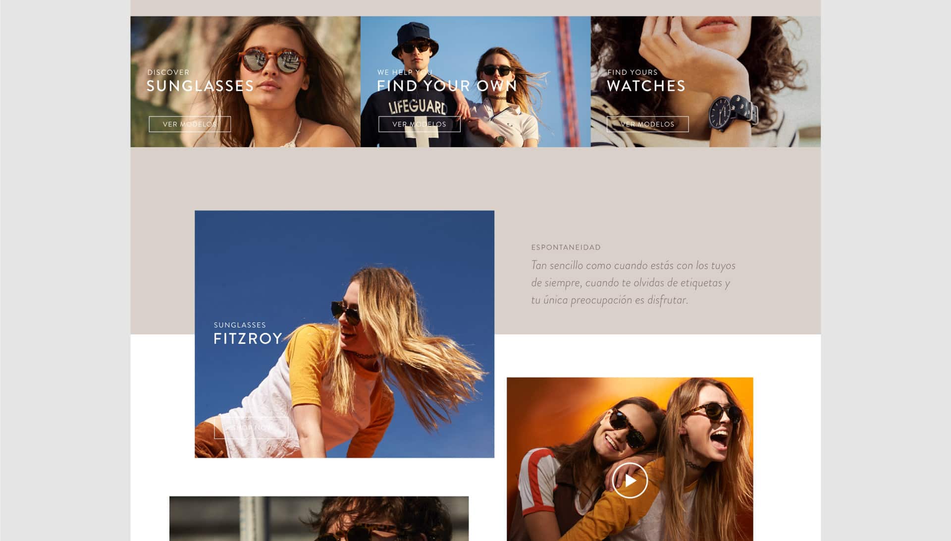
An immersive and efficient web experience