Lloyd's
Lloyd's is the best-selling women's clothing brand in El Corte Inglés. It is focused on quality, timeless, outdoor design.
Identity Redesign
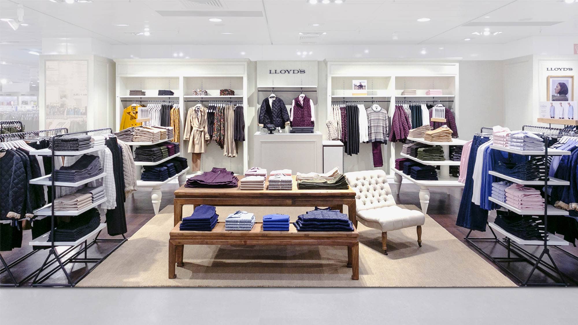
It is important that brand recognition occurs at more than one point of contact and not only through a logo applied heterogeneously as has been the case up to now.
The new visual identity was planned with elements such as a differential typography, to provide exclusivity and personality, as well as its own and differential chromatic palette. It was also an important challenge to delimit the use of the symbol and wordmark as well as to achieve recognizable layouts and editorial systems that would adapt to the new photographic style proposed by the El Corte Inglés team for the brand.
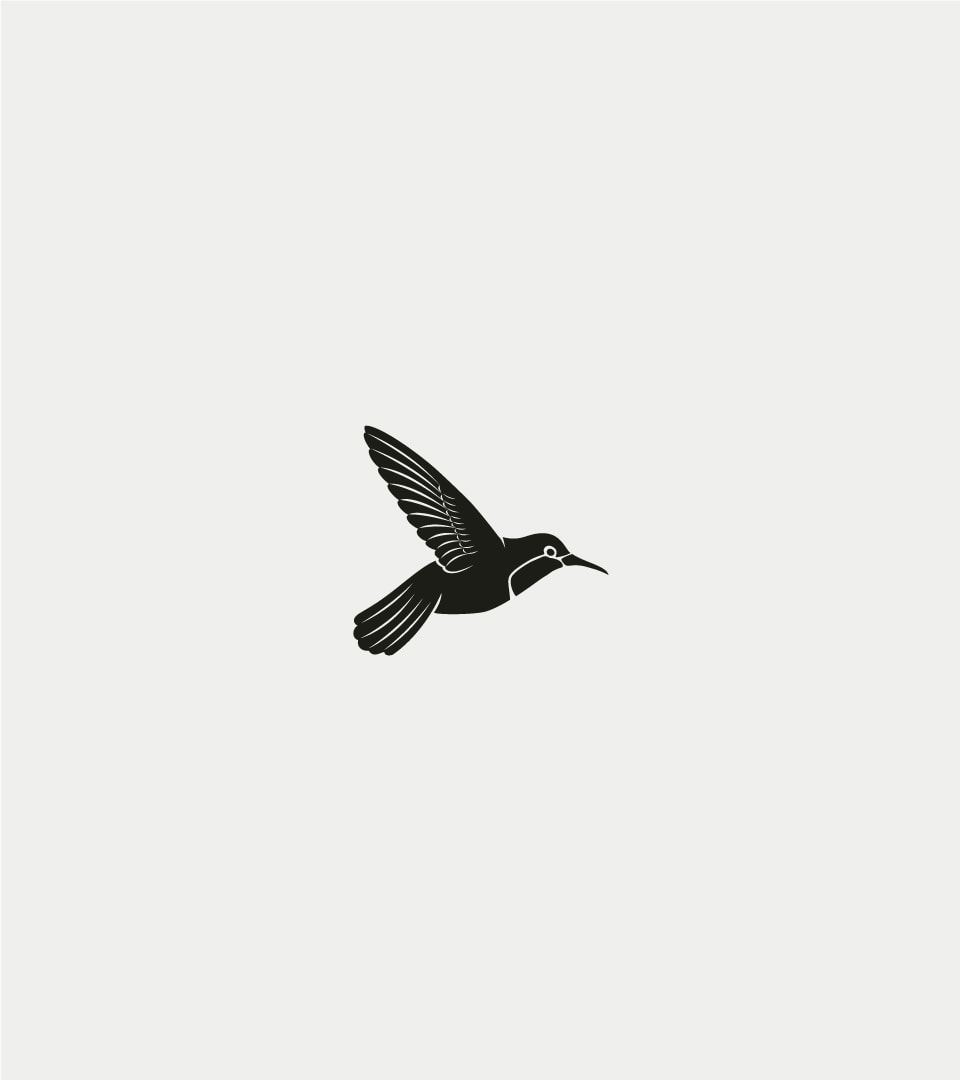
A new isotype with character
More functional, more current and capable of generating much greater brand recognition.
According to preliminary studies, the vast majority of audiences identify the Lloyd's logo with a bird, so it was important to keep the symbol as the element that generates the most equity in the brand.
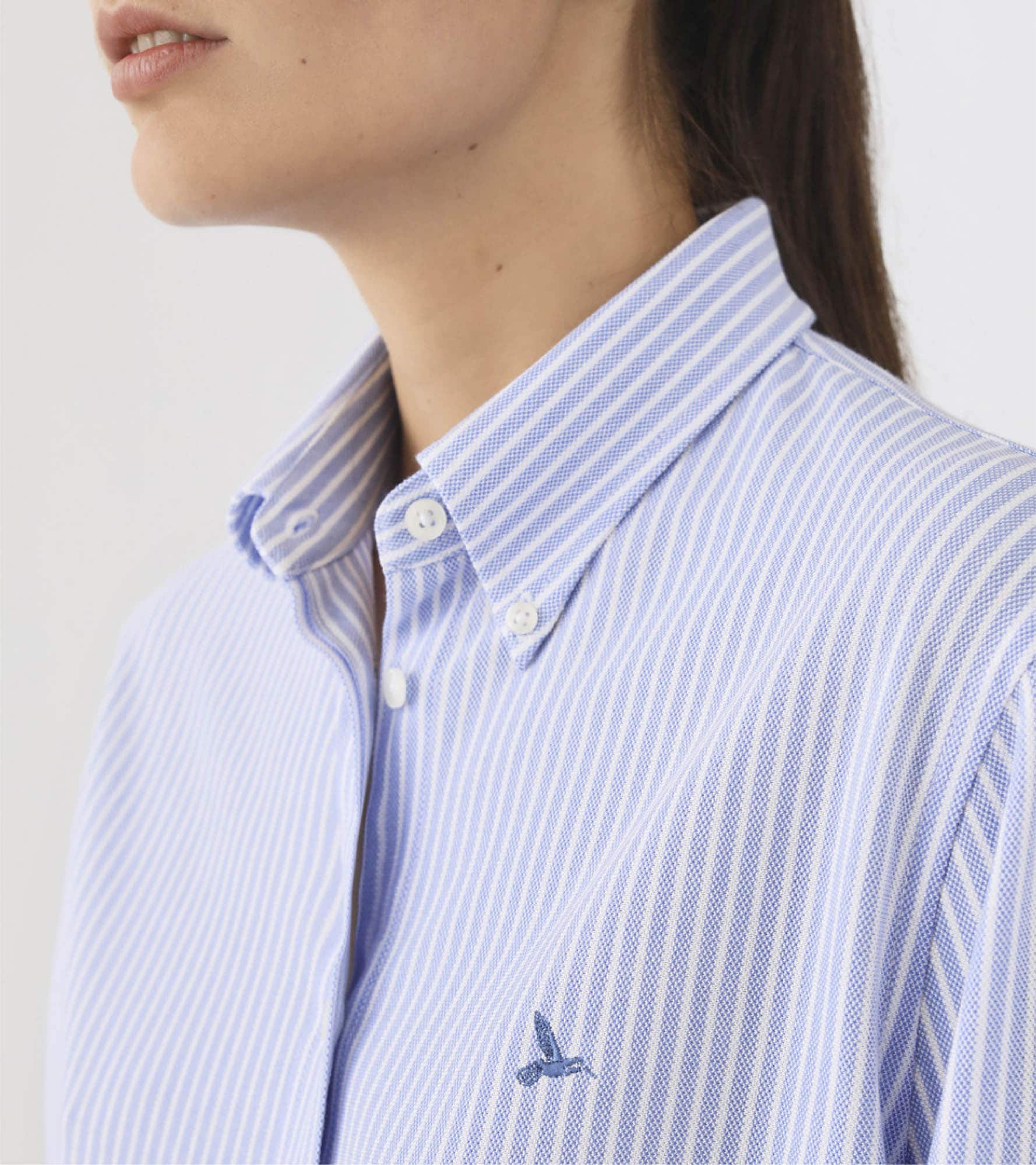
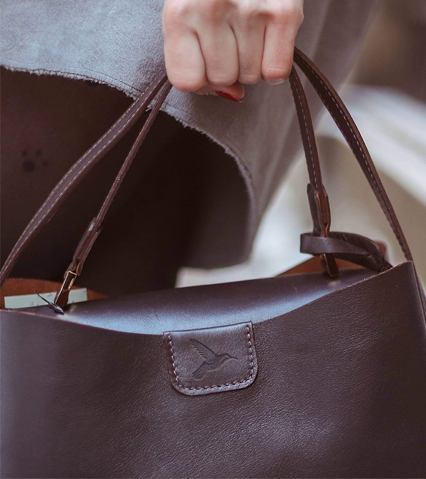
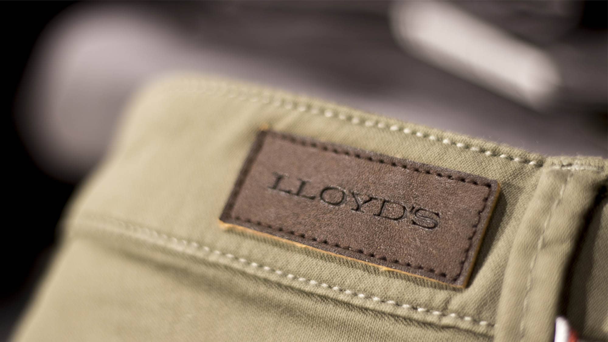
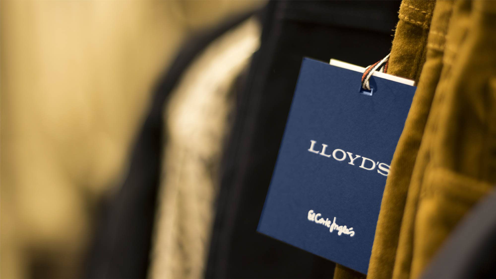
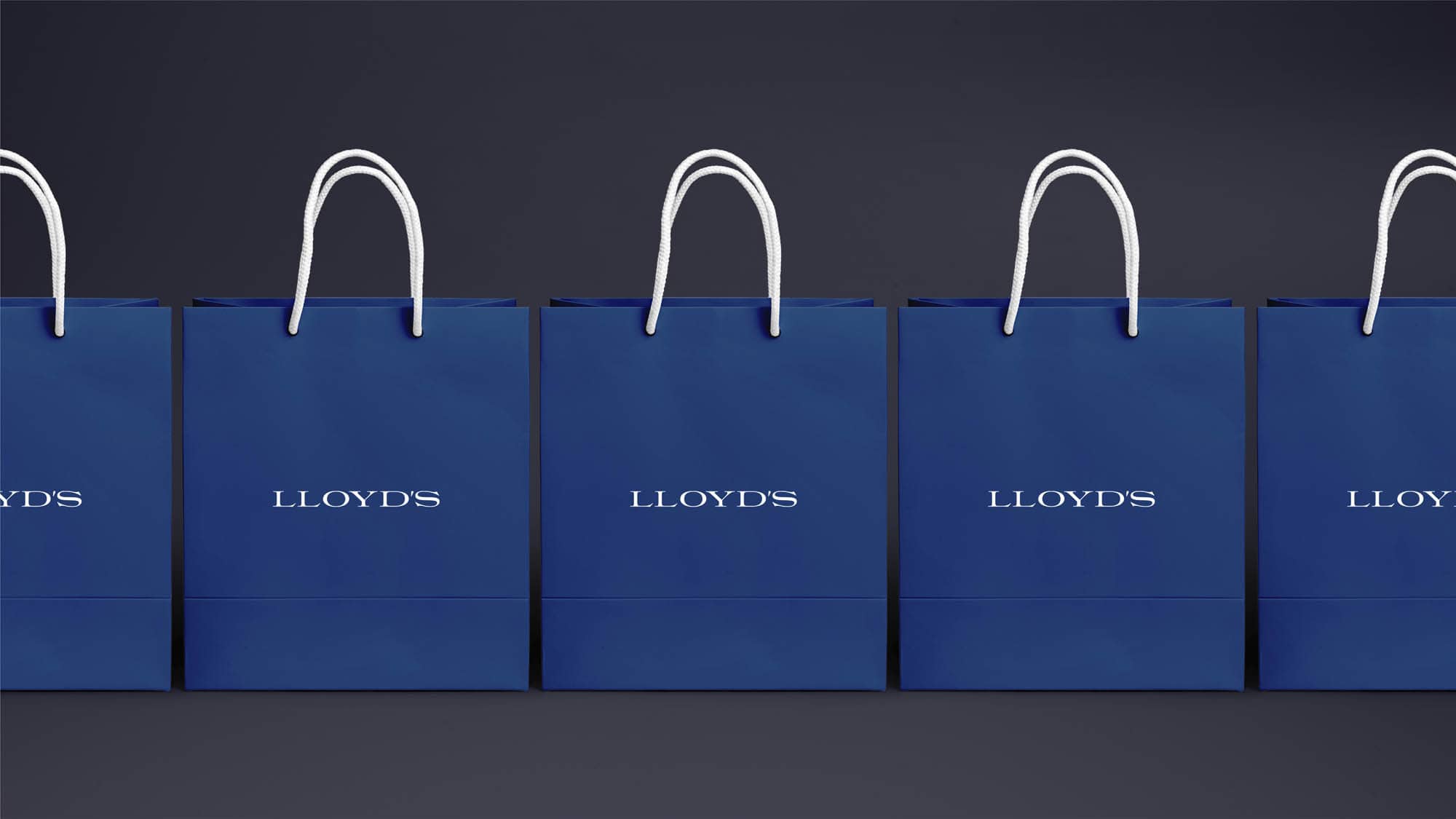
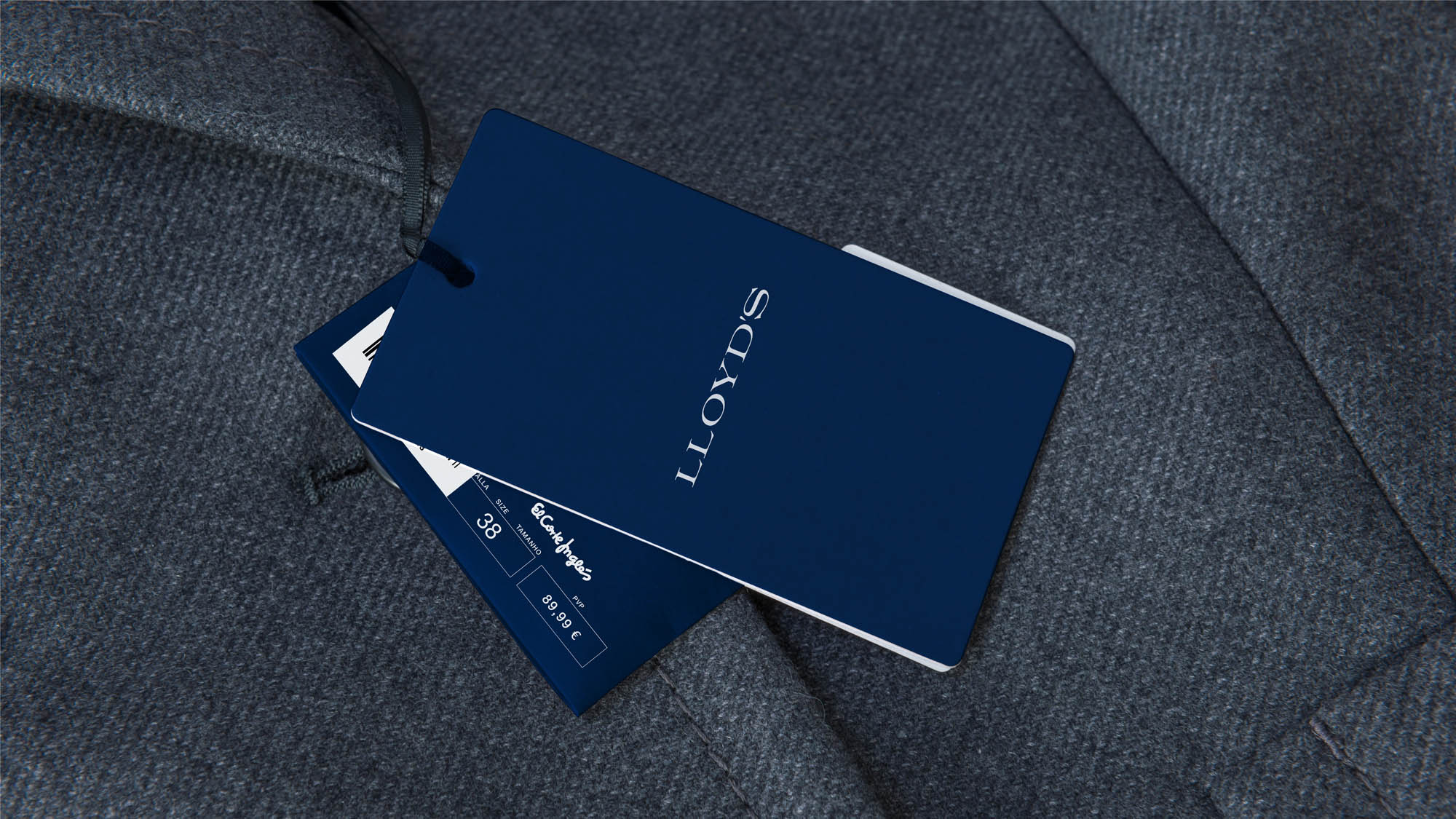
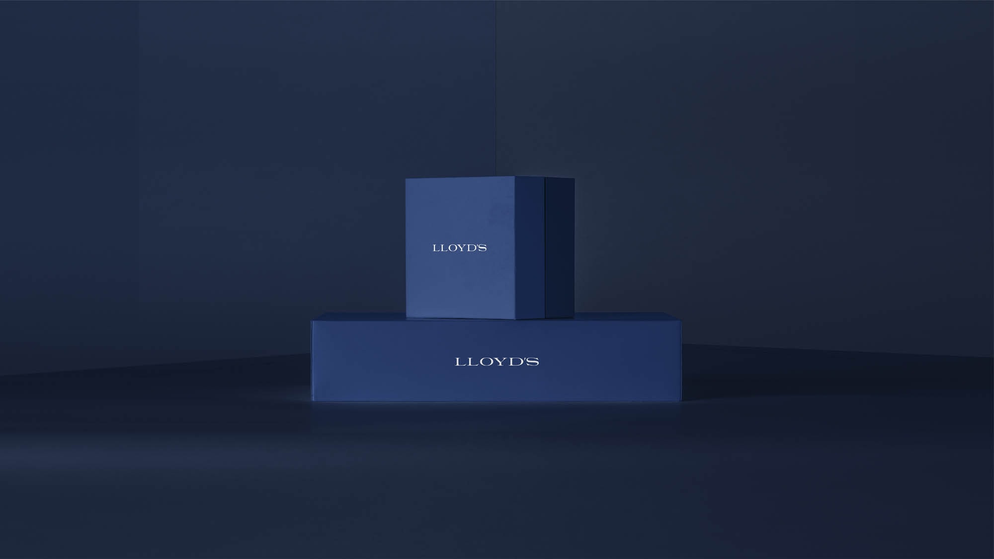
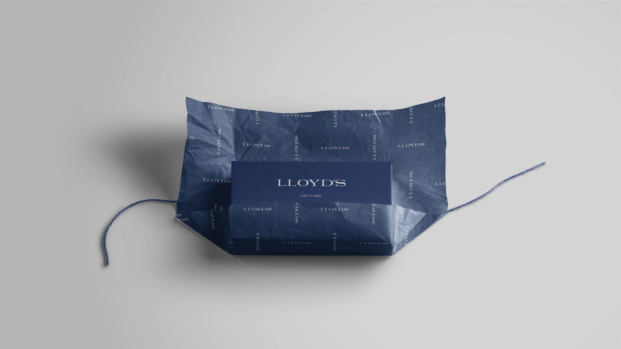
Taking care of the details
For this project, all possible elements have been taken into account to generate a positive perception.
Every label, every little detail has to be perfectly cared for in order to transmit to our audiences a brand of quality and design.
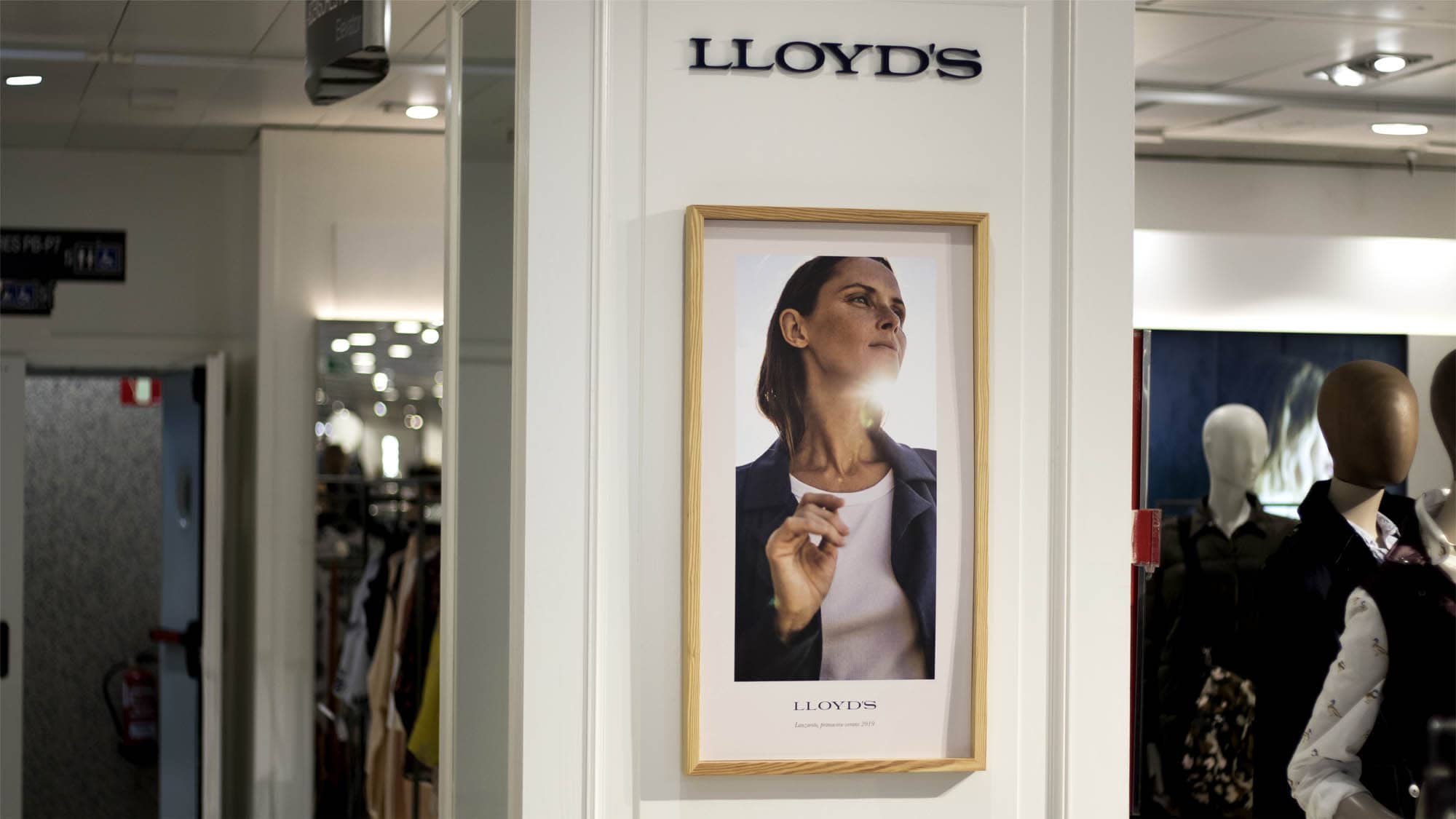
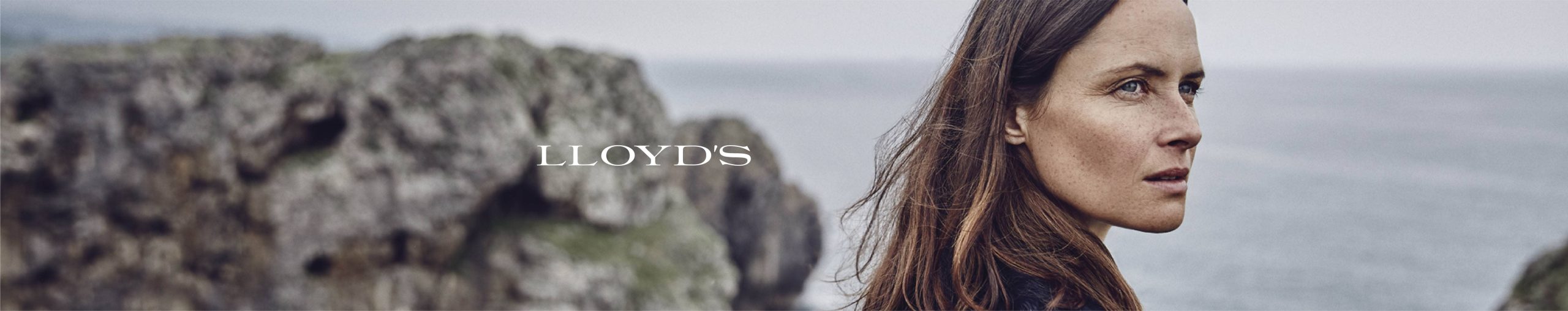
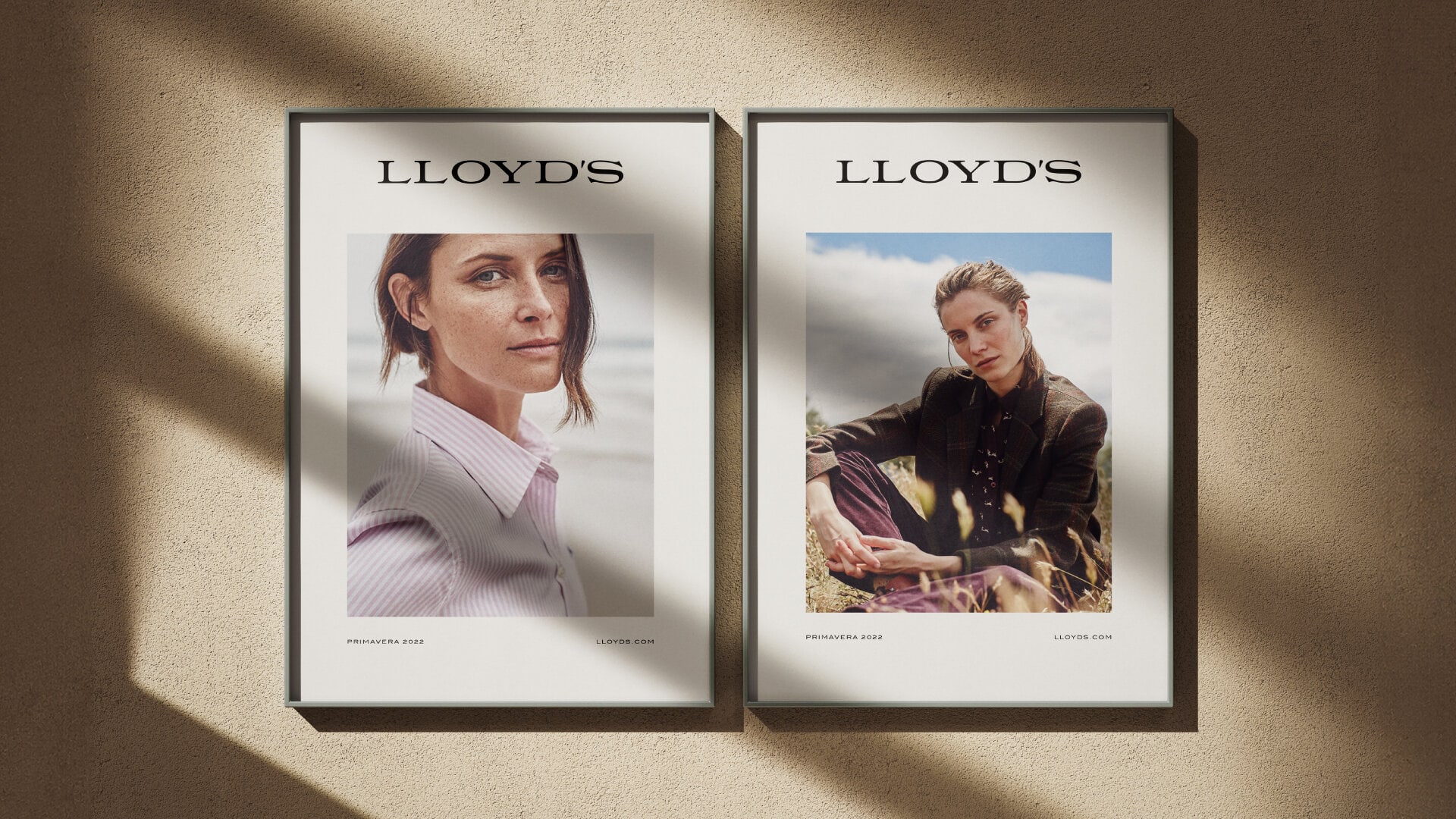
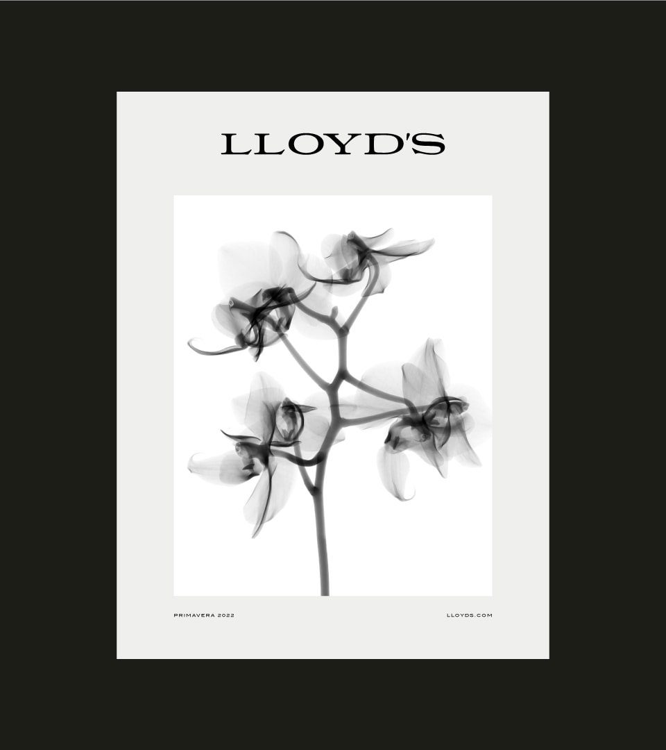
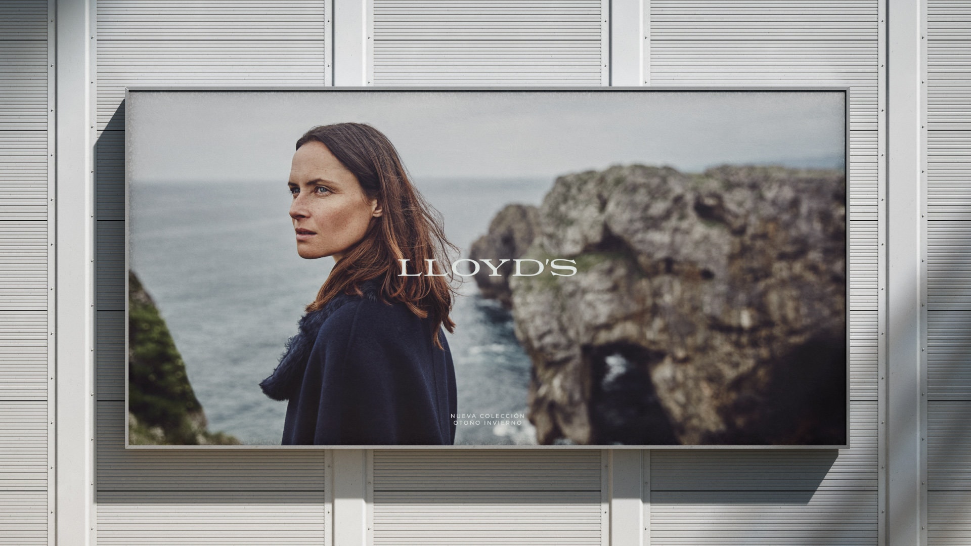
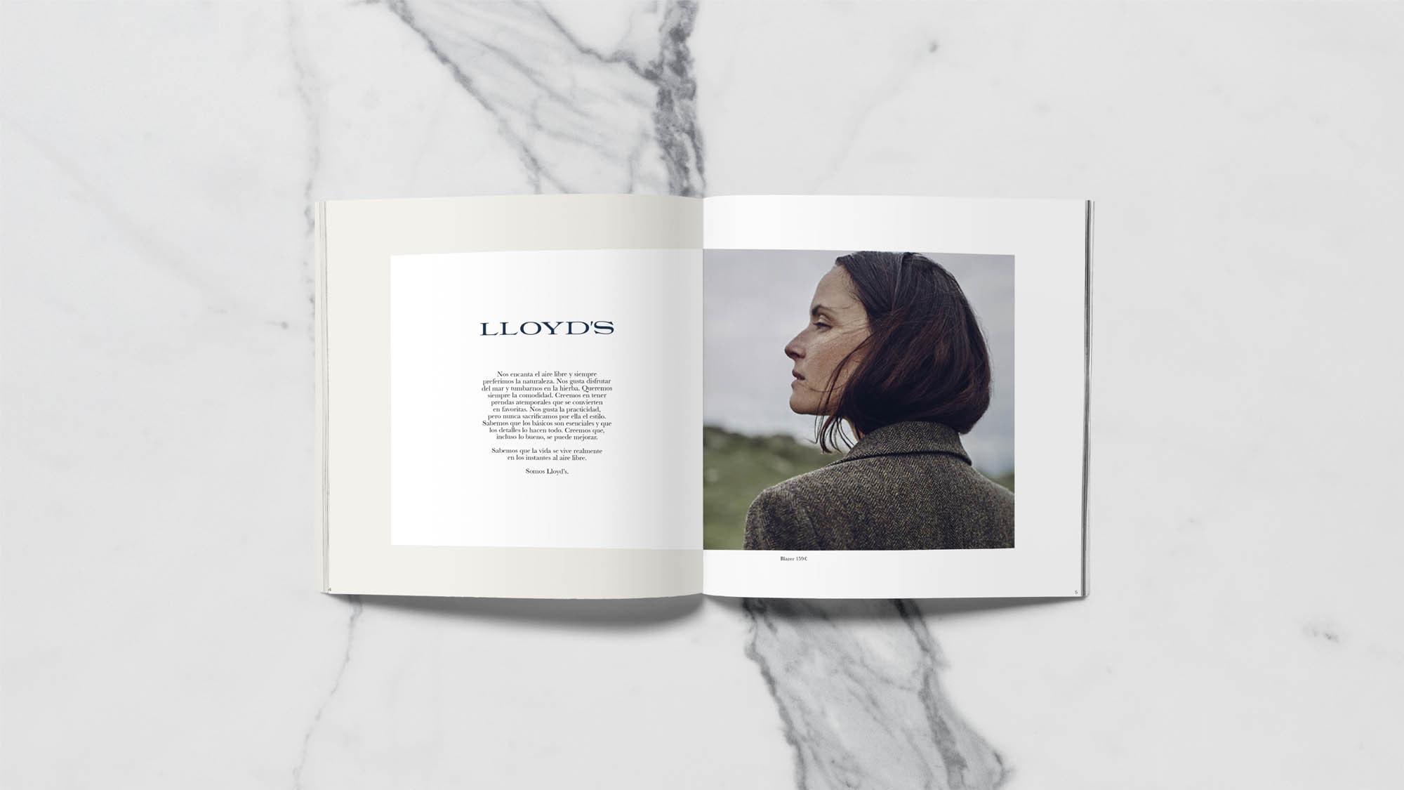
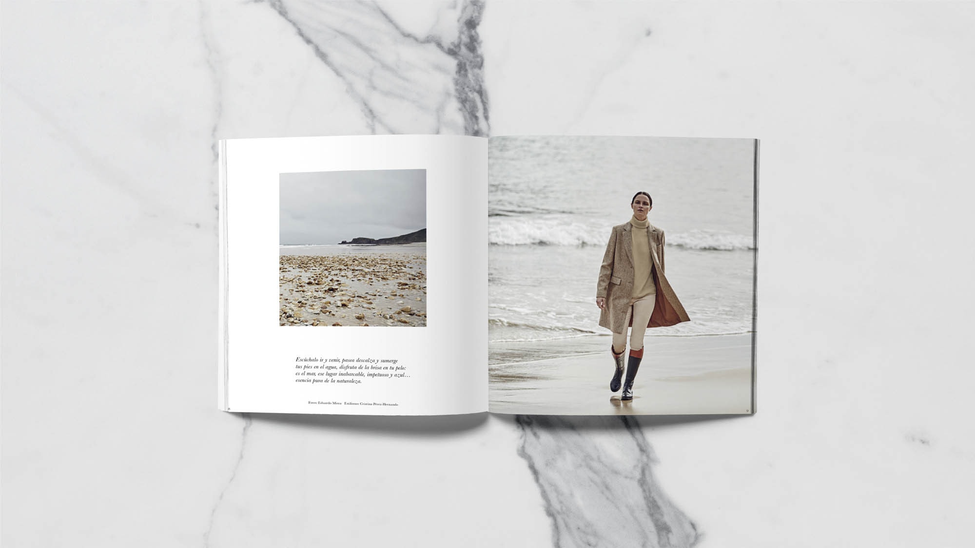
Editorial
The systems and layout of editorial applications is an important activity for a fashion brand.
Minimalist and elegant layouts that accompany the brand as it is developed season by season by the El Corte Inglés team.
A brand to last over time
The new Lloyd's brand has been conceived to be timeless, and at the same time to be able to adapt season by season to new collections and novelties without losing its values and essence.