For wine lovers, drinking an Albariño is not the same as drinking a glass of Manzanilla. That is why, when we had before us the project of redesigning the cellar of Día wines, we chose to create a different image for each one, according to its personality and origin.
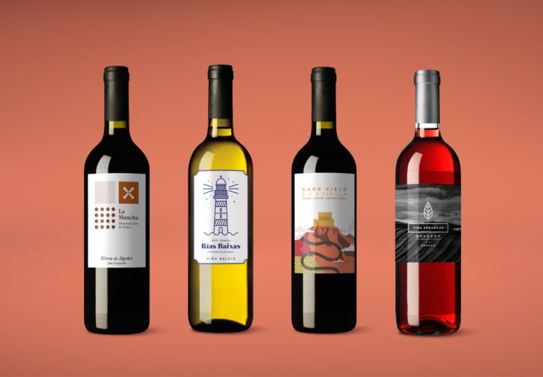
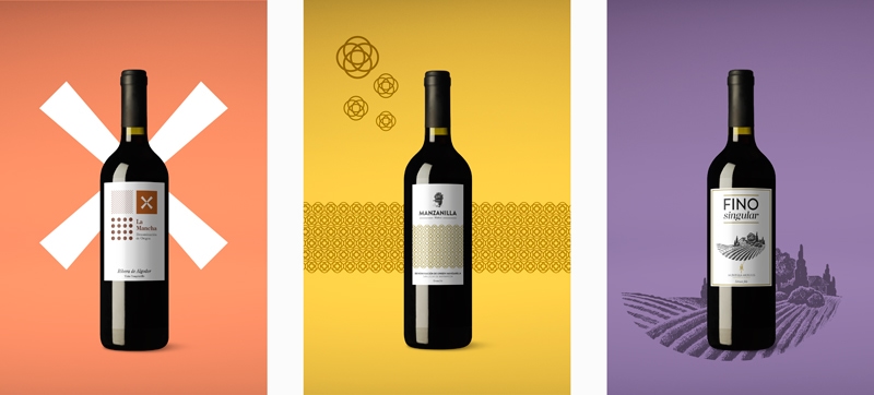
La Mancha: si hay algo característico de esta zona son sus campos. En este diseño los hemos representado con formas geométricas y los tonos propios de la tierra, para poner en valor el origen del vino.
Manzanilla: the typical Andalusian carnations are the main element of this label, which stands out from its competitors for its modern and geometric style.
Fino singular: classic wine design that leaves all the prominence to the appellation of origin and the traditional illustration of the Andalusian countryside.
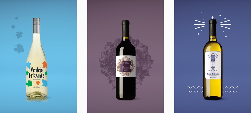
Verdejo Frizzante: un diseño refrescante, sorprendente y natural que cuenta los valores del propio vino.
Chardonnay: we represent this classic wine with an engraving of grapes that we combine with a simple dry stick typography that reduces solemnity and brings modernity to the design.
Rías Baixas: a fresh design, like Albariño itself, that conveys the maritime origin of the wine in a fun and distinctive way.
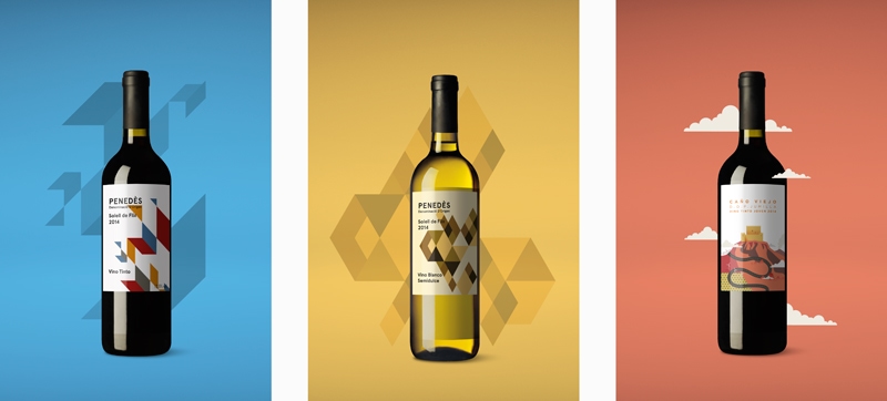
Penedés: the blue of the sky and the sea, the yellow of the earth and the red of the wine come together in attractive geometric shapes that make this bottle different and attractive.
Jumilla: por sus uvas, los vinos de esta denominación de origen tienen un intenso colorido en el que nos hemos basado para crear este packaging, protagonizado por una ilustración del castillo de Jumilla rodeado de los campos castellanos.
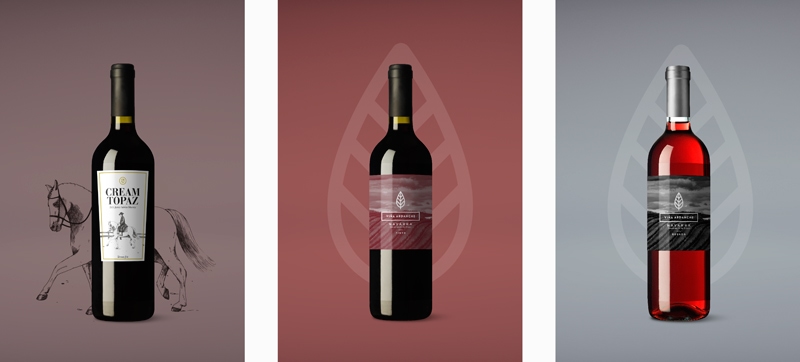
Jerez Cream: subtle golden touches for a typically Andalusian wine whose design features another southern classic: the Andalusian horseman dressed in a short dress.
Navarra. An elegant and sober design, based on the image of the Navarre countryside, in which we play with colors to differentiate between red and rosé.