Uondi
Uondi is a fresh brand created with the intention of renewing the lingerie and swimwear retail sector.
Careful designs, affordable prices and high traffic locations make Uondi a brand that is close and current.
Simplicity with character
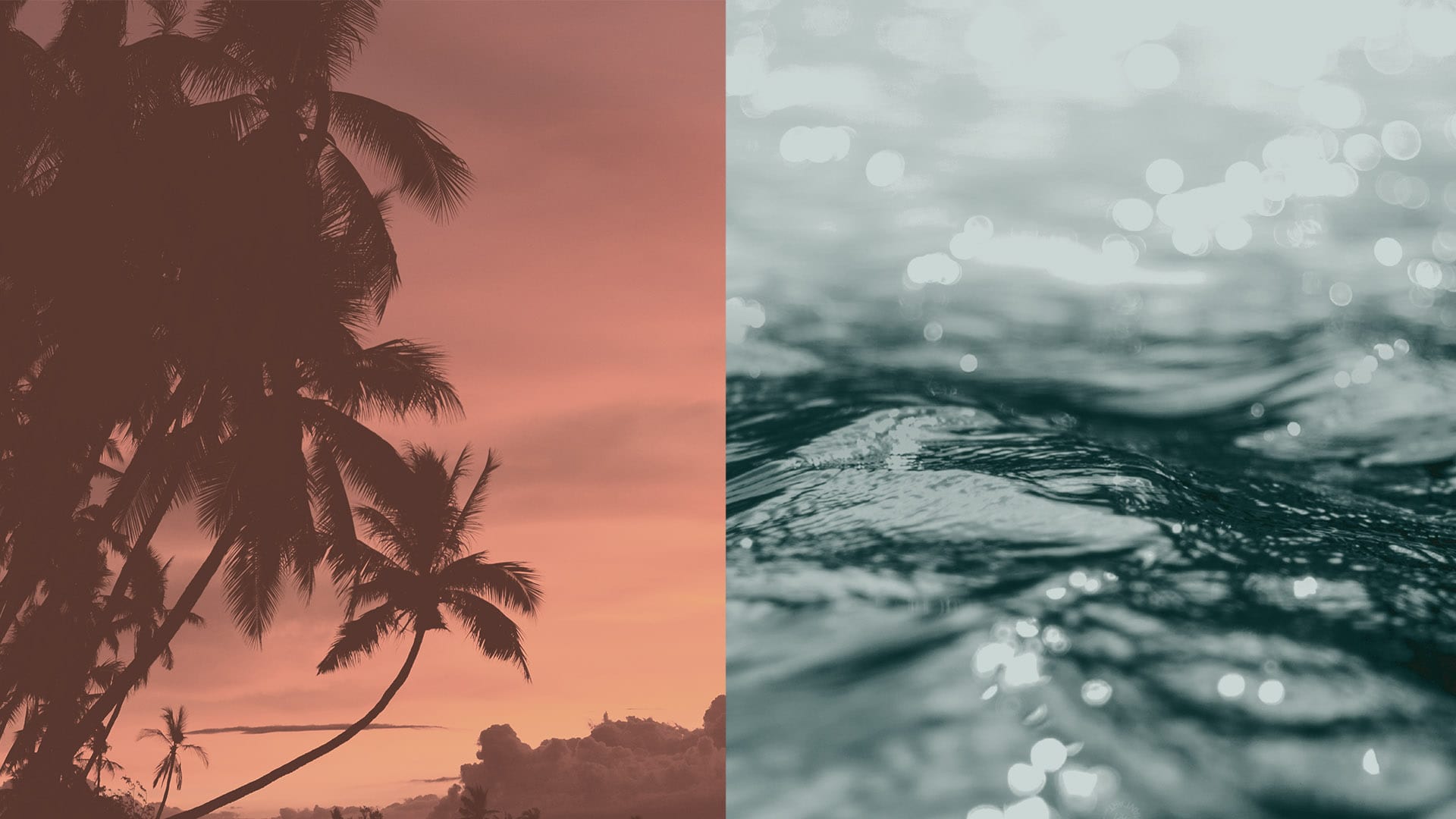
A fantasy name that evokes wonderful moments and experiences, represented by young and feminine typographic finishes.
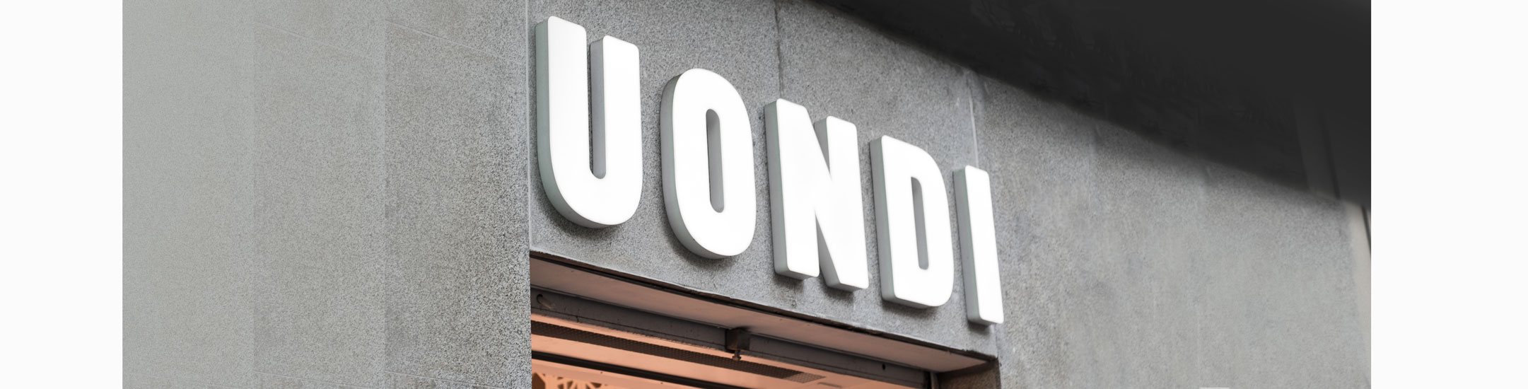
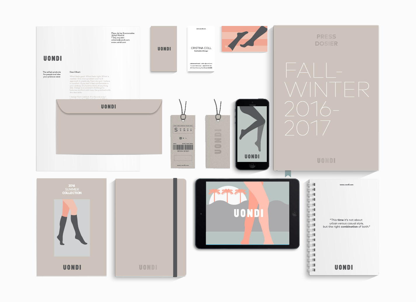
A TAILOR-MADE JOB
From the logotype we created a unique and differentiated identity for Uondi, youthful features that will be incorporated later in each of the contact points.
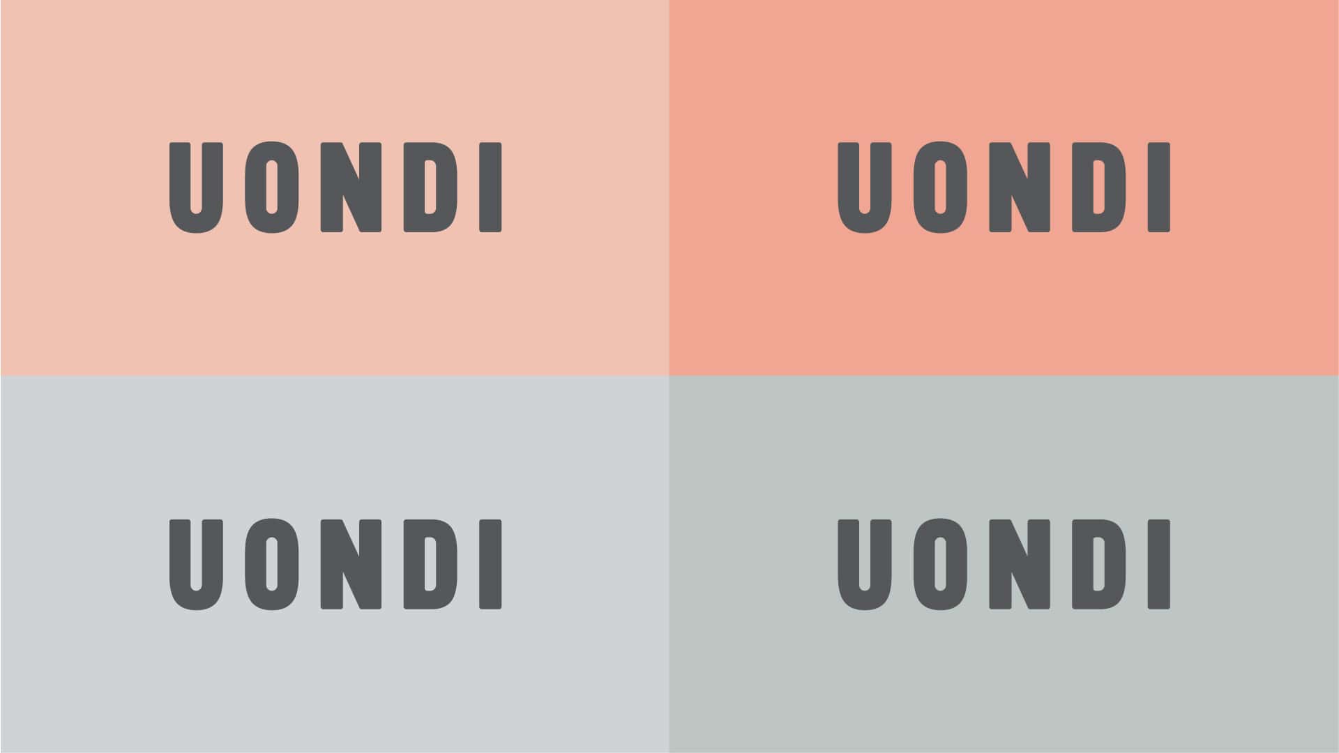
Feminine Colors
A range of pastel colors specially combined to convey the warmth and freshness of the brand.
Warmth
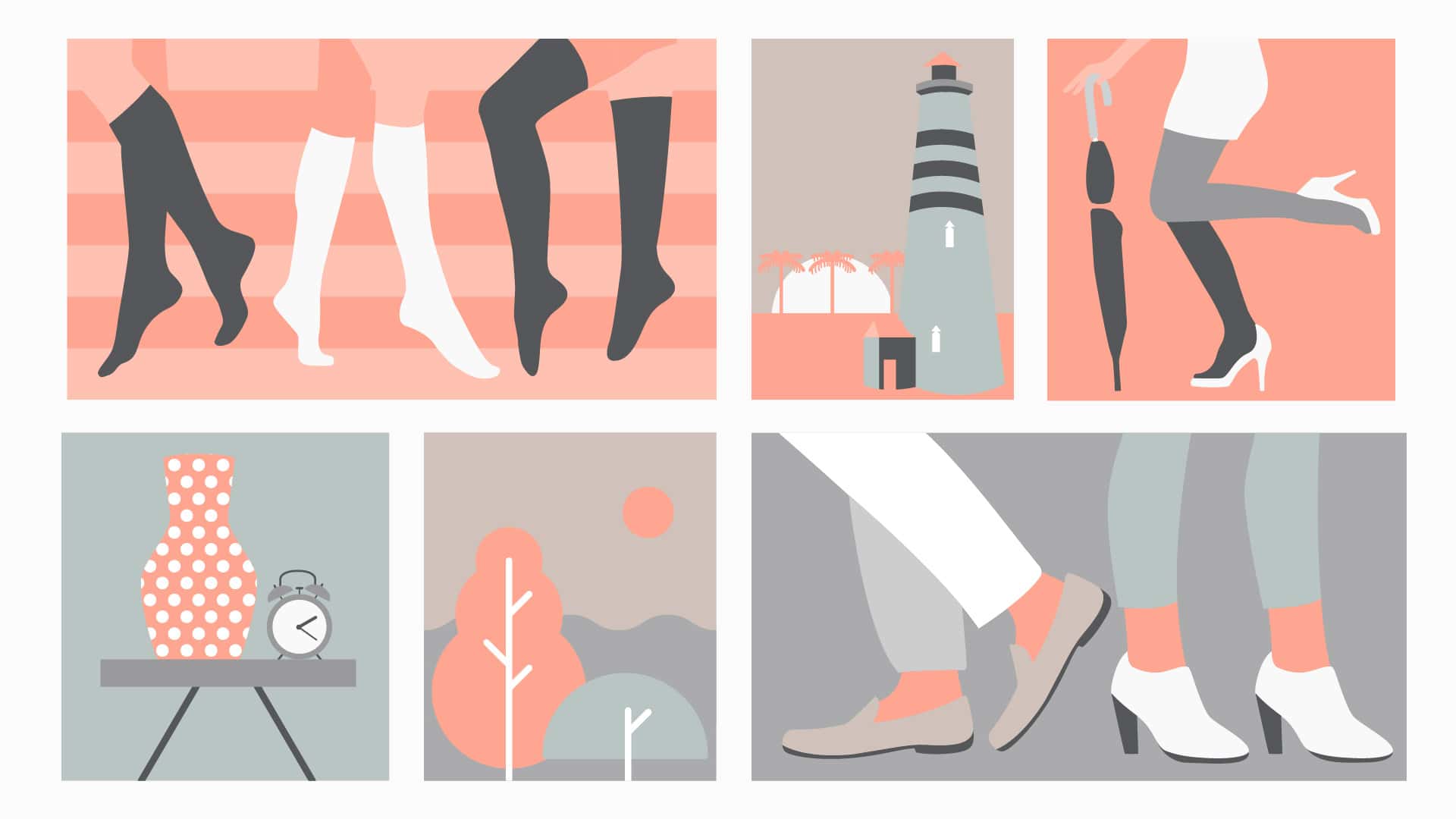
A distinctive illustrative style
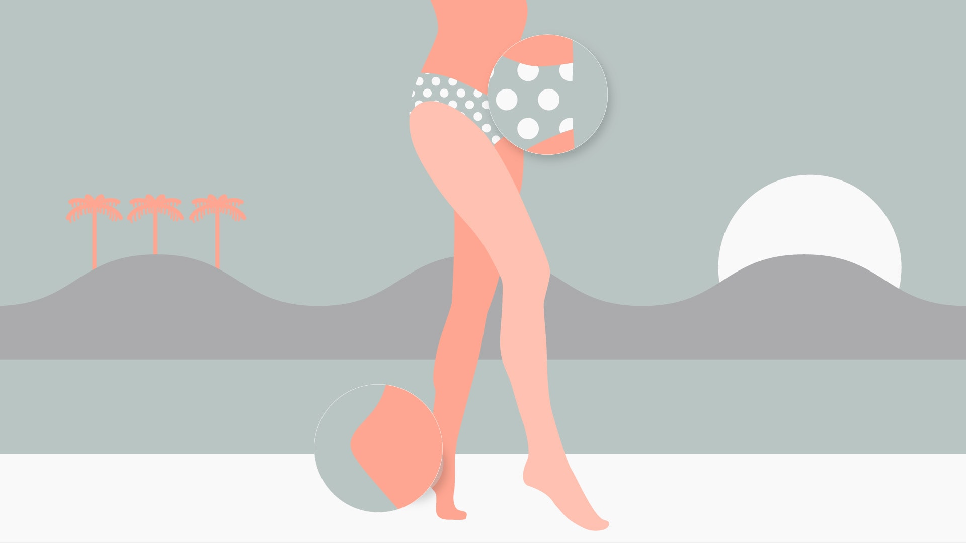
From the logotype we created a unique and differentiated identity for Uondi, an illustrative style with a youthful character that will be later incorporated in each of the contact points.
Applying the style
Uondi is aimed at a modern public, very connected and with a purchasing decision marked by trends that follows restlessly every day. Its colors bring femininity, its shapes youthfulness and its layouts simplicity.
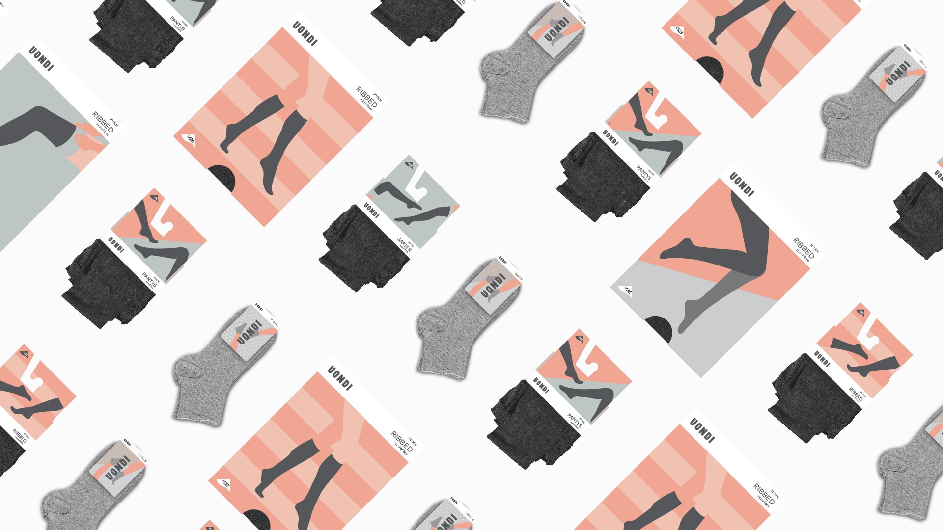
Packaging
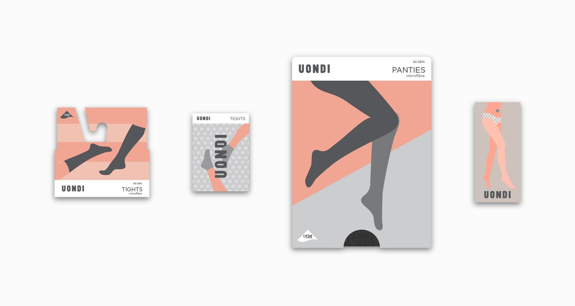
Prepared for a wide range of private label products
Uondi is a unique private label distributor. This makes its products a key asset of its business model.
Baud worked on a product range architecture system and a modular packaging design. A 100% work in line with the brand that provides versatility and ease when creating new product lines that provide flexibility to its business model.