Joan the Mad

Joan the Mad
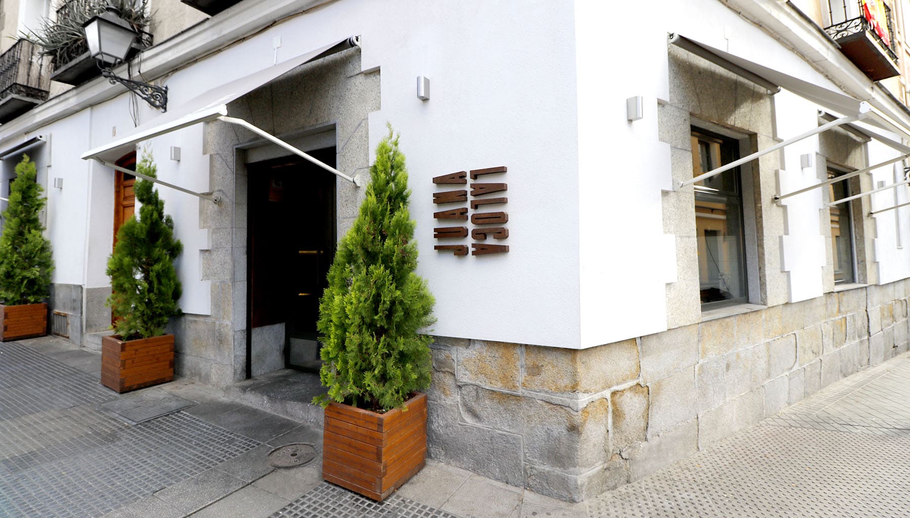
Juana La Loca has been, for years, one of the most groundbreaking gastronomic proposals in the traditional neighborhood of La Latina.
A pintxo bar where quality and avant-garde go hand in hand and that needed a new image that would transmit its position as a reference in the capital's restaurants.
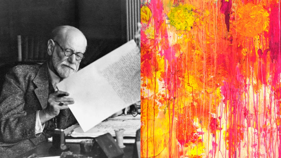
Art, gastronomy and madness
Juana La Loca needed a more leading, current and competitive brand that would be at the same level of restaurant quality and consolidate the project as a unique, notorious proposal, ready to grow.
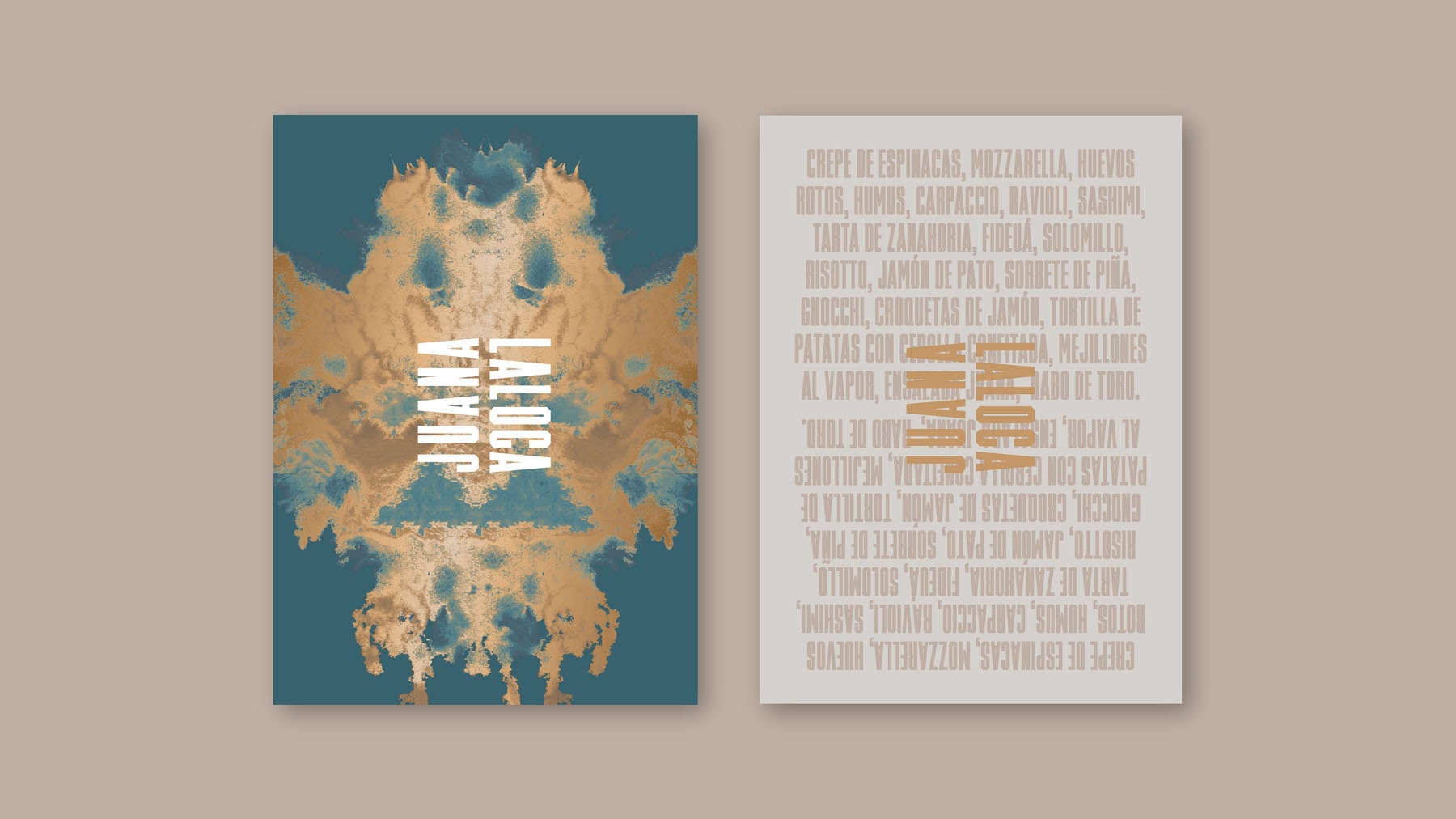
Based on the name of the restaurant, we were inspired by the famous Rorschach test, a universal visual expression of art and creative explosion, and we built an identity that reflects the character and vision of the company, its quality and its position in relation to the competition.
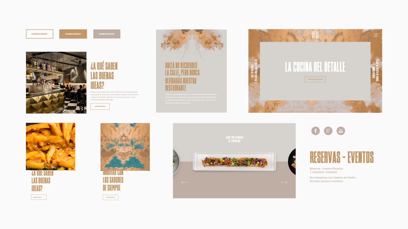
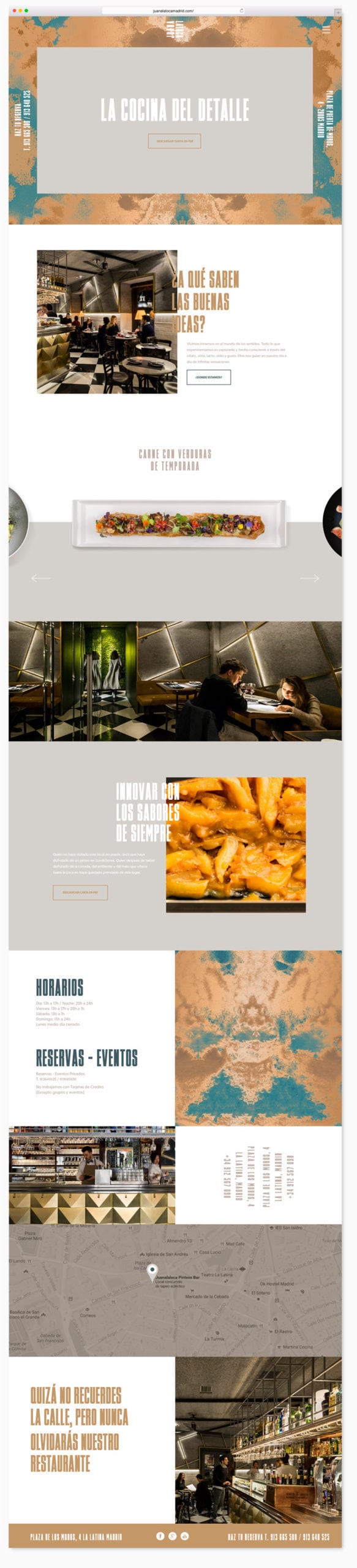
One concept, multiple applications
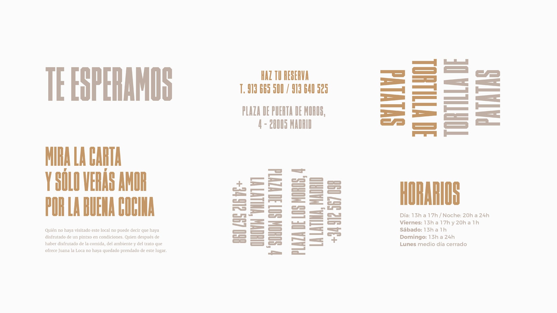
We make typography a fundamental element of the brand that helps us to create identity down to the smallest detail.
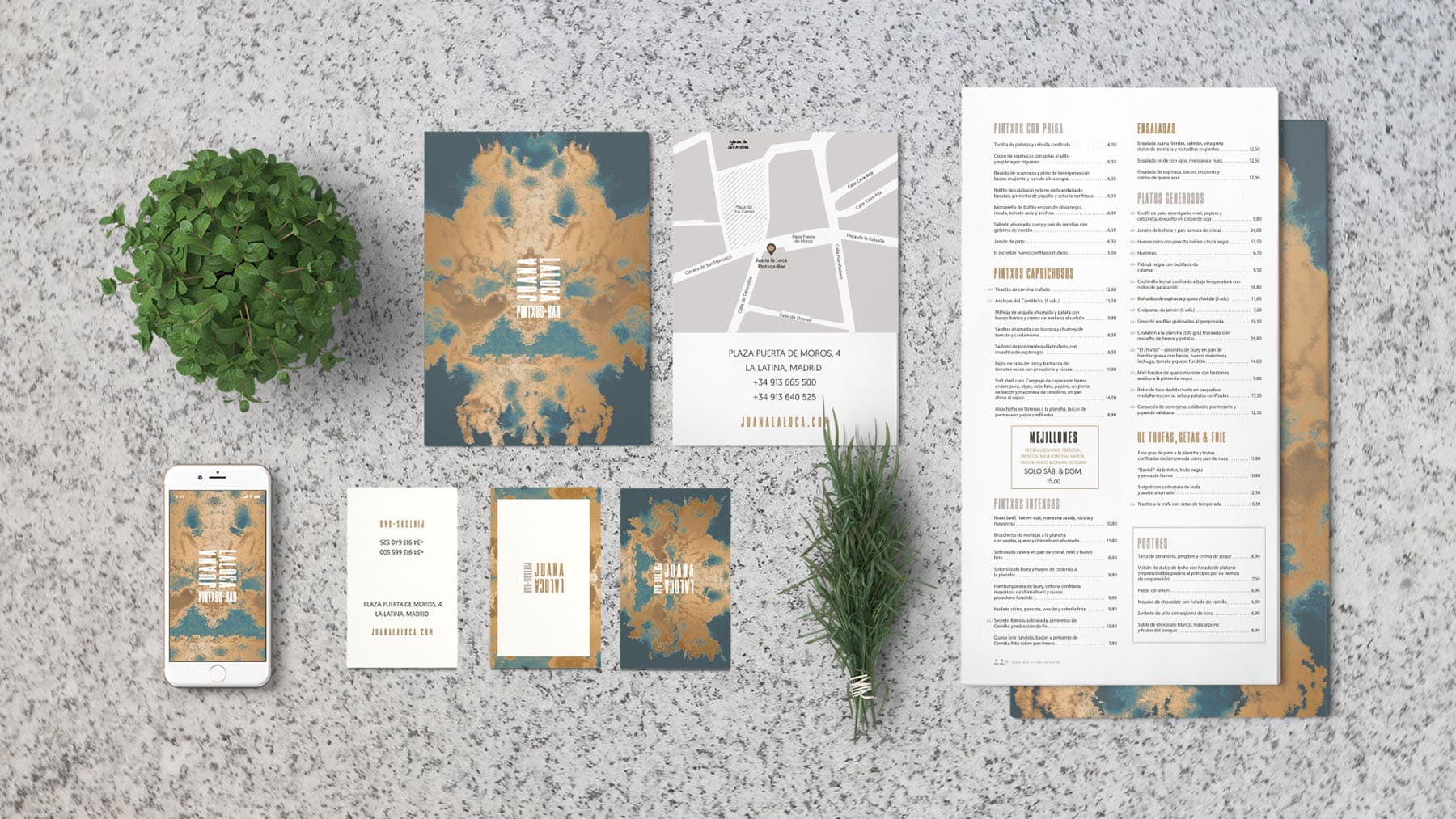
Finishes as unique as the brand
The brand, beyond the logo
We worked on a visual identity based on symmetry and stains, so identifiable from the Rorschach tests; a typographic composition that works as an illustrative style and an elegant and groundbreaking chromatic range make this an unconventional and appealing brand.