Almost everyone involved in the design thinks that the signage standardized subway New York is entirely made in Helvetica. This generalized thought takes much more strength after watching the recent and great documentary "Helvetica, the movie" where it is exposed as an absolute truth that the signage of the NY subway is made entirely in Helvetica.
A recent study conducted by Paul Shaw for the Aiga disproves these assertions and makes a magnificent journey through the history typography of the New York subway.
The labyrinth.
Anyone who has visited New York can realize how crazy and labyrinthine it is to travel through it. This complexity is due among other things to the fact that the system was initially composed of several independent rail systems depending on the neighborhood.
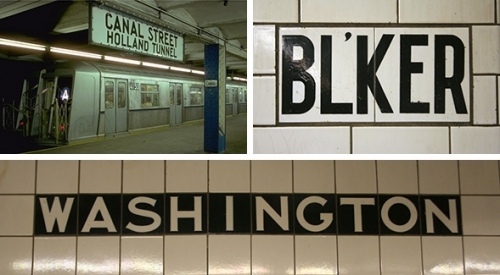
The first signs were created by Heins & LaFarge architects in 1908 of one of the systems (IRT), which created the signage in the form of mosaic tiles. Throughout the years until about 1950 this type of mosaic was maintained. signage with a wide variety of typography.


In the 1950s, signs were added during extensions with the addition of porcelain designs o on metal plates with hand-applied paint using mainly black and white. In addition to the directional and indicator signs, the following were added signals with prohibitions, such as no smoking or no animals.
Reaching order from chaos.
All of the chaos that was emerging was finally spotted and a proposal was accepted from George Salomontypographer and designer at Appleton, Parsons & Co. which made a manual in which mainly tried to unify everything using on a black background and highlighting colors the typography that he considered the most readable of the moment. Futura Demibold. Its own manual prepared from the study indicated that these changes had to be made quickly for the sake of the subway users.
Of all the visionary Salomon's ideas, only one proposal he made for the map was taken seriously.

Signage in the 1960s
During the 1960s all the suburbanites in the world, especially in Europe, began to make a redesign of its signage and to put aside all the chaos that had been accumulating.
The main example of this 180-degree turnaround was that of the city of Milan in which Helvetica was used for the first time. For the metro of Paris, Adrian Frutiger made a custom-made "metro" typeface based on the well-known univers.
In 1965 Massimo Vignellimoved from Milan to New York City to work in Unimark International which finally and after the recommendation of the MoMa was selected for the redesign of the subway image.
These initially attempted to include Helvetica for the signageThe use of the typeface for this purpose was not accepted without any apparent sense (in the Helvetica movie we can see the history by Helvetica Juggernaut, which develops the theme further).
Due to all the problems that occurred when trying to get the permits to implement it, finally the company Unimark, supported by the heavyweight Bob Noorda decided to use Standard against Vignelli who supported the great virtues of Helvetica. Years later they had the opportunity to change it to Helvetica, but they were reportedly so busy controlling production and placements in the spaces that they did not have time to correctly select the typeface to be used.

The seventies and graffiti
The explosion of graffiti in the New York subways was a trend that greatly concerned Vignelli because of the undermined that was becoming his signage which had its base on a white background.
In order to combat this and to add extra readability, it was decided to invert the colors of the signage a white typeface on black background. Helvetica was incorporated.


News
Supposedly this typeface should be respected as the final and unique form of signage for the metro, all of this information would be collected in a manual that no was strictly respected over the years.

