In the design world, the discussion about typography es una de las situaciones clásicas que se suelen dar en la relación Diseñador – Cliente. Por temas de accesibilidad de cara a los manuales de visual identity y los usos internos de la marca también suele salir este debate.
Arial was created in 1982 by Monotypenot Microsoft, to be used in IBM applications. Years later it was incorporated in Windows 3.1 until it was recently removed in Windows Vista.
Helvetica was designed by Max Miedinger in 1957 and was considered the Sans Serif par excellence.
Both fonts are derived from the fonts known as Grotesk and although it is often considered that Arial is a copy of Helvetica, this statement is incorrect, since in the same way it could be said that Helvetica is a copy of Akzidenz Grotesk when it is not in any way. Arial has certain features that make it unique and different from other sans serifs (they can be seen especially in the G, Q and R for example).

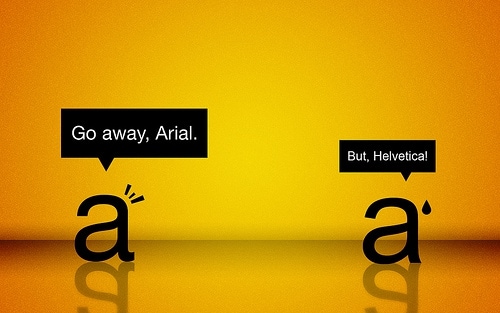
The real issue between Helvetica and Arial.
Helvetica considered the best typography Sans Serifbecause of Microsoft's heavy bombardment, has been displaced in the face of the average user or to the general public by Arialwhich has a truly poorer finish.
The saddest thing about it is that it all started because of avoiding paying Helvetica's license fee and creating a cheap alternative, something that Monotipe often did. This was decisive to be included in IBM and later in Microsoft Packs.. Over the years, users did not want to pay an extra license fee and decided to use the fonts included with the system, contributing to this exaltation of Arial that has placed it on everyone's lips as "the best font in the world". typography".